Badge
Badges are used to show notifications, counts, or status information on navigation items such as NavigationBar or NavigationRail destinations or a button's icon.
ft.FilledIconButton(
    icon=ft.Icons.PHONE,
    badge=ft.Badge(label="3"),
)
Inherits: BaseControl
Properties
alignment- Aligns thelabelrelative to the content of the badge.bgcolor- The background color of thelabel.label- The label of this badge.label_visible- Whether thelabelshould be visible.large_size- The badge's label height iflabelis provided.offset- Combined withalignmentto determine the location of thelabelrelative to the content.padding- The padding added to thelabel.small_size- The badge's label diameter iflabelis not provided.text_color- The color of the text shown in thelabel.text_style- The text style to use for text in thelabel.
Examples
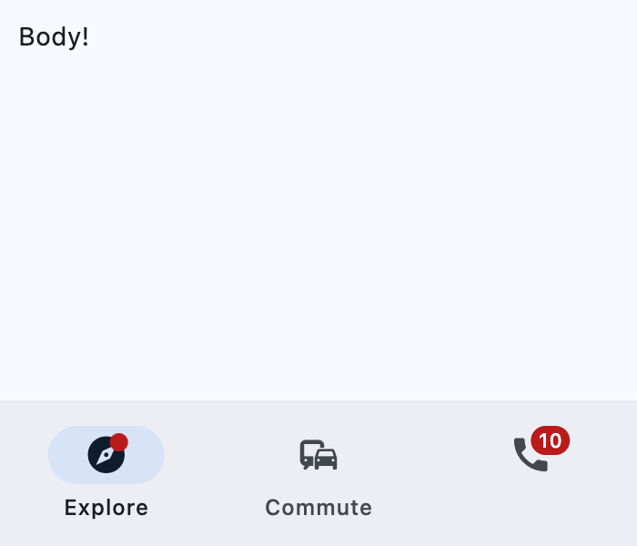
Badge
import flet as ft


def main(page: ft.Page):
    page.title = "Badge example"
    page.navigation_bar = ft.NavigationBar(
        destinations=[
            ft.NavigationBarDestination(
                icon=ft.Icon(
                    ft.Icons.EXPLORE,
                    badge=ft.Badge(small_size=10),
                ),
                label="Explore",
            ),
            ft.NavigationBarDestination(
                icon=ft.Icons.COMMUTE,
                label="Commute",
            ),
            ft.NavigationBarDestination(
                icon=ft.Icon(
                    ft.Icons.PHONE,
                    badge="10",
                )
            ),
        ]
    )
    page.add(ft.SafeArea(content=ft.Column(controls=[ft.Text("Body!")])))


if __name__ == "__main__":
    ft.run(main)
Properties
alignmentclass-attributeinstance-attribute
alignment: Alignment | None = NoneAligns the label relative to the content of the badge.
The alignment positions the label in similar way
Container.content is positioned using Container.alignment,
except that the badge alignment is resolved as if the label was a
large_size square and offset is added to the result.
Has effect only used if label is also provided.
bgcolorclass-attributeinstance-attribute
bgcolor: ColorValue | None = NoneThe background color of the label.
labelclass-attributeinstance-attribute
label: StrOrControl | None = NoneThe label of this badge.
Typically a 1 to 4 characters text.
If the label is not provided, the badge is shown as a filled circle of
small_size diameter.
If label is provided, it is a StadiumBorder shaped
badge with height equal to large_size.
label_visibleclass-attributeinstance-attribute
label_visible: bool = TrueWhether the label should be visible.
It can be used to create a badge only shown under certain conditions.
large_sizeclass-attributeinstance-attribute
large_size: Number | None = NoneThe badge's label height if label is provided.
If the default value is overridden then it may be useful to also override
padding and alignment.
Defaults to BadgeTheme.large_size, or if that is None,
falls back to 16.
offsetclass-attributeinstance-attribute
offset: OffsetValue | None = NoneCombined with alignment to determine the location of the label relative to the content.
Has effect only used if label is also provided.
paddingclass-attributeinstance-attribute
padding: PaddingValue | None = NoneThe padding added to the label.
Defaults to BadgeTheme.padding, or if that is None,
falls back to 4 pixels on the left and right.
Has effect only if label is not None.
small_sizeclass-attributeinstance-attribute
small_size: Number | None = NoneThe badge's label diameter if label is not provided.
Defaults to BadgeTheme.small_size, or if that is None,
falls back to 6.
text_colorclass-attributeinstance-attribute
text_color: ColorValue | None = NoneThe color of the text shown in the label.
It overrides the color of the label's text_style.