FloatingActionButton
A floating action button is a circular icon button that hovers over content to promote a primary action in the application. Floating action button is usually set to page.floating_action_button, but can also be added as a regular control at any place on a page.
Example:
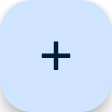
ft.FloatingActionButton(icon=ft.Icons.ADD)
Inherits: LayoutControl
Properties
autofocus- True if the control will be selected as the initial focus.bgcolor- Button background color.clip_behavior- Defines how thecontentis clipped.content- The content of this button.disabled_elevation- The elevation of this button when disabled.elevation- The elevation of this button.enable_feedback- Whether detected gestures should provide acoustic and/or haptic feedback.focus_color- The color to use for filling this button when it has input focus.focus_elevation- The elevation of this button when it has input focus.foreground_color- The default foreground color for icons and text within this button.highlight_elevation- The elevation of this button when it is highlighted.hover_color- The color to use for filling this button when hovered.hover_elevation- The elevation of this button it is enabled and being hovered over.icon- Icon shown in this button.mini- Controls the size of this button.mouse_cursor- The cursor to be displayed when a mouse pointer enters or is hovering over this control.shape- The shape of the FAB's border.splash_color- The color to use for the ink splash.url- The URL to open when this button is clicked.
Events
on_click- Called when a user clicks this button.
Examples
Handling clicks
import flet as ft
def main(page: ft.Page):
page.title = "Floating Action Button"
page.theme_mode = ft.ThemeMode.LIGHT
page.horizontal_alignment = ft.CrossAxisAlignment.CENTER
page.padding = 0
page.scroll = ft.ScrollMode.HIDDEN
count = 1
def handle_fab_click(e: ft.Event[ft.FloatingActionButton]):
nonlocal count
page.add(
ft.ListTile(
title=ft.Text(f"Tile {count}"),
bgcolor=ft.Colors.TEAL_300,
leading=ft.Icon(
ft.Icons.CIRCLE_OUTLINED,
color=ft.Colors.DEEP_ORANGE_300,
),
on_click=lambda x: print(x.control.title.value + " was clicked!"),
)
)
page.show_dialog(ft.SnackBar(ft.Text("Tile was added successfully!")))
count += 1
page.floating_action_button = ft.FloatingActionButton(
key="handling_clicks_fab",
icon=ft.Icons.ADD,
on_click=handle_fab_click,
bgcolor=ft.Colors.LIME_300,
)
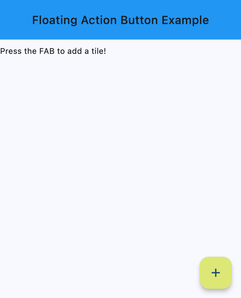
page.add(
ft.SafeArea(
content=ft.Column(
controls=[
ft.Container(
bgcolor=ft.Colors.BLUE,
padding=ft.Padding.all(20),
content=ft.Row(
alignment=ft.MainAxisAlignment.CENTER,
controls=[
ft.Text(
value="Floating Action Button Example",
style=ft.TextStyle(
size=20,
weight=ft.FontWeight.W_500,
),
)
],
),
),
ft.Text("Press the FAB to add a tile!"),
],
),
)
)
if __name__ == "__main__":
ft.run(main)
Properties
autofocusclass-attributeinstance-attribute
autofocus: bool = FalseTrue if the control will be selected as the initial focus. If there is more than one control on a page with autofocus set, then the first one added to the page will get focus.
clip_behaviorclass-attributeinstance-attribute
clip_behavior: ClipBehavior = ClipBehavior.NONEDefines how the content is clipped.
contentclass-attributeinstance-attribute
content: StrOrControl | None = NoneThe content of this button.
Raises:
- ValueError - If neither
iconnor a validcontent(string or visible Control) is provided.
disabled_elevationclass-attributeinstance-attribute
disabled_elevation: Number | None = NoneThe elevation of this button when disabled.
Defaults to elevation.
Raises:
- ValueError - If it is not greater than or equal to
0.
elevationclass-attributeinstance-attribute
elevation: Number | None = NoneThe elevation of this button.
Defaults to 6.
Raises:
- ValueError - If it is not greater than or equal to
0.
enable_feedbackclass-attributeinstance-attribute
enable_feedback: bool | None = NoneWhether detected gestures should provide acoustic and/or haptic feedback. On Android, for example, setting this to True will produce a click sound and a long-press will produce a short vibration.
focus_colorclass-attributeinstance-attribute
focus_color: ColorValue | None = NoneThe color to use for filling this button when it has input focus.
focus_elevationclass-attributeinstance-attribute
focus_elevation: Number | None = NoneThe elevation of this button when it has input focus.
Defaults to 8.
Raises:
- ValueError - If it is not greater than or equal to
0.
foreground_colorclass-attributeinstance-attribute
foreground_color: ColorValue | None = NoneThe default foreground color for icons and text within this button.
highlight_elevationclass-attributeinstance-attribute
highlight_elevation: Number | None = NoneThe elevation of this button when it is highlighted.
Defaults to 12.
Raises:
- ValueError - If it is not greater than or equal to
0.
hover_colorclass-attributeinstance-attribute
hover_color: ColorValue | None = NoneThe color to use for filling this button when hovered.
hover_elevationclass-attributeinstance-attribute
hover_elevation: Number | None = NoneThe elevation of this button it is enabled and being hovered over.
Defaults to 8.
Raises:
- ValueError - If it is not greater than or equal to
0.
iconclass-attributeinstance-attribute
icon: IconDataOrControl | None = NoneIcon shown in this button.
miniclass-attributeinstance-attribute
mini: bool = FalseControls the size of this button.
By default, floating action buttons are non-mini and have a height and width of
56.0 logical pixels. Mini floating action buttons have a height and width of
40.0 logical pixels with a layout width and height of 48.0 logical pixels.
mouse_cursorclass-attributeinstance-attribute
mouse_cursor: MouseCursor | None = NoneThe cursor to be displayed when a mouse pointer enters or is hovering over this control.
shapeclass-attributeinstance-attribute
shape: OutlinedBorder | None = NoneThe shape of the FAB's border.
splash_colorclass-attributeinstance-attribute
splash_color: ColorValue | None = NoneThe color to use for the ink splash.
Events
on_clickclass-attributeinstance-attribute
on_click: (
    ControlEventHandler[FloatingActionButton] | None
) = None
Called when a user clicks this button.