FilledTonalButton
A filled tonal button is an alternative middle ground between FilledButton and OutlinedButton buttons. They're useful in contexts where a lower-priority button requires slightly more emphasis than an outline would give, such as "Next" in an onboarding flow. Tonal buttons use the secondary color mapping.
ft.FilledTonalButton(content="Tap me")

Inherits: Button
Examples
FilledTonalButton
play_arrowTry Online
import flet as ft
def main(page: ft.Page):
page.title = "FilledTonalButton Example"
page.add(
ft.SafeArea(
content=ft.Column(
controls=[
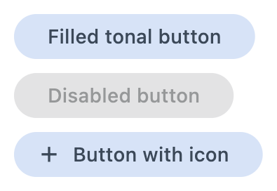
ft.FilledTonalButton(content="Filled tonal button"),
ft.FilledTonalButton(content="Disabled button", disabled=True),
ft.FilledTonalButton(
content="Button with icon",
icon=ft.Icons.ADD_OUTLINED,
),
],
),
)
)
if __name__ == "__main__":
ft.run(main)