FilledButton
Filled buttons have the most visual impact after the FloatingActionButton, and is typically used for important, final actions that complete a flow, like "Save", "Join now", or "Confirm".
ft.FilledButton(content="Tap me")

Inherits: Button
Examples
FilledButton
play_arrowTry Online
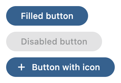
import flet as ft


def main(page: ft.Page):
    page.title = "FilledButton Example"

    page.add(
        ft.SafeArea(
            content=ft.Column(
                controls=[
                    ft.FilledButton(content="Filled button"),
                    ft.FilledButton(content="Disabled button", disabled=True),
                    ft.FilledButton(
                        content="Button with icon",
                        icon=ft.Icons.ADD_OUTLINED,
                    ),
                ],
            ),
        )
    )


if __name__ == "__main__":
    ft.run(main)