CupertinoSegmentedButton
An iOS-style segmented button.
Example:
ft.CupertinoSegmentedButton(
    selected_index=1,
    controls=[
        ft.Text("One"),
        ft.Text("Two"),
        ft.Text("Three"),
    ],
)

Inherits: LayoutControl
Properties
border_color- The color of this button's border.click_color- The color used to fill the background of this control when temporarily interacting with through a long press or drag.controls- The list of segments to be displayed.disabled_color- The color used to fill the background of the segment when it is disabled.disabled_text_color- The color used for the text of the segment when it is disabled.padding- This button's padding.selected_color- The color of this button when it is selected.selected_index- The index (starting from 0) of the selected segment in thecontrolslist.unselected_color- The color of this button when it is not selected.
Events
on_change- Called when the state of the button is changed - when one of thecontrolsis clicked.
Examples
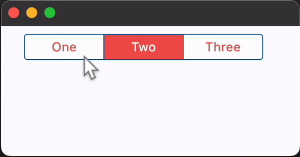
CupertinoSegmentedButton
import flet as ft


def main(page: ft.Page):
    page.theme_mode = ft.ThemeMode.LIGHT

    page.add(
        ft.SafeArea(
            content=ft.CupertinoSegmentedButton(
                selected_index=1,
                selected_color=ft.Colors.RED_400,
                on_change=lambda e: print(f"selected_index: {e.data}"),
                padding=ft.Padding.symmetric(vertical=20, horizontal=50),
                controls=[
                    ft.Text("One"),
                    ft.Container(
                        padding=ft.Padding.symmetric(vertical=10, horizontal=30),
                        content=ft.Text("Two"),
                    ),
                    ft.Container(
                        padding=ft.Padding.symmetric(vertical=5, horizontal=10),
                        content=ft.Text("Three"),
                    ),
                ],
            ),
        )
    )


if __name__ == "__main__":
    ft.run(main)
Segments padding
import flet as ft


def main(page: ft.Page):
    page.theme_mode = ft.ThemeMode.LIGHT

    segmented_button = ft.CupertinoSegmentedButton(
        selected_index=1,
        selected_color=ft.Colors.RED_400,
        unselected_color=ft.Colors.GREY_400,
        on_change=lambda e: print(f"selected_index: {e.data}"),
        controls=[
            ft.Text("All"),
            ft.Container(
                padding=ft.Padding.symmetric(vertical=30, horizontal=0),
                content=ft.Text("None"),
            ),
            ft.Container(
                padding=ft.Padding.symmetric(vertical=0, horizontal=30),
                content=ft.Text("Some"),
            ),
        ],
    )

    def handle_vertical_change(e: ft.Event[ft.Slider]):
        segmented_button.controls[1].padding = ft.Padding.only(
            top=e.control.value,
            bottom=e.control.value,
        )

    def handle_horizontal_change(e: ft.Event[ft.Slider]):
        segmented_button.controls[2].padding = ft.Padding.only(
            left=e.control.value,
            right=e.control.value,
        )

    page.add(
        ft.SafeArea(
            content=ft.Column(
                controls=[
                    segmented_button,
                    ft.Text("Vertical padding button 1:"),
                    ft.Slider(
                        label="{value}",
                        min=0,
                        max=50,
                        divisions=50,
                        value=30,
                        on_change=handle_vertical_change,
                    ),
                    ft.Text("Horizontal padding button 2:"),
                    ft.Slider(
                        label="{value}",
                        min=0,
                        max=50,
                        divisions=50,
                        value=30,
                        on_change=handle_horizontal_change,
                    ),
                    ft.Text(
                        value=(
                            "*note that padding changes to one segment can effect "
                            "padding on other segments*"
                        ),
                        theme_style=ft.TextThemeStyle.LABEL_MEDIUM,
                        color=ft.Colors.ORANGE_ACCENT,
                    ),
                ],
            ),
        )
    )


if __name__ == "__main__":
    ft.run(main)
Properties
border_colorclass-attributeinstance-attribute
border_color: ColorValue | None = NoneThe color of this button's border.
click_colorclass-attributeinstance-attribute
click_color: ColorValue | None = NoneThe color used to fill the background of this control when temporarily interacting with through a long press or drag.
Defaults to the selected_color
with 20% opacity.
controlsinstance-attribute
controls: list[Control]The list of segments to be displayed.
Raises:
- ValueError - If it does not contain at least two visible
Controls.
disabled_colorclass-attributeinstance-attribute
disabled_color: ColorValue | None = NoneThe color used to fill the background of the segment when it is disabled.
If None, this color will be 50% opacity of the
selected_color when
the segment is selected. If the segment is unselected, this color will be
set to the unselected_color.
disabled_text_colorclass-attributeinstance-attribute
disabled_text_color: ColorValue | None = NoneThe color used for the text of the segment when it is disabled.
selected_colorclass-attributeinstance-attribute
selected_color: ColorValue | None = NoneThe color of this button when it is selected.
selected_indexclass-attributeinstance-attribute
selected_index: int = 0The index (starting from 0) of the selected segment in the controls list.
Raises:
- IndexError - If
selected_indexis out of range relative to the visible controls.
unselected_colorclass-attributeinstance-attribute
unselected_color: ColorValue | None = NoneThe color of this button when it is not selected.
Events
on_changeclass-attributeinstance-attribute
on_change: (
    ControlEventHandler[CupertinoSegmentedButton] | None
) = None
Called when the state of the button is changed - when one of the controls is clicked.