Shimmer
Applies an animated shimmering effect to its content.
Use it to create lightweight loading placeholders or to add motion to otherwise static layouts.
ft.Shimmer(
    base_color=ft.Colors.with_opacity(0.3, ft.Colors.GREY_400),
    highlight_color=ft.Colors.WHITE,
    content=ft.Column(
        controls=[
            ft.Container(height=80, bgcolor=ft.Colors.GREY_300),
            ft.Container(height=80, bgcolor=ft.Colors.GREY_300),
            ft.Container(height=80, bgcolor=ft.Colors.GREY_300),
        ],
    ),
)

Inherits: LayoutControl
Properties
base_color- Base color used when nogradientis provided.content- The control to render with the shimmer effect.direction- Direction of the shimmering animation.gradient- Custom gradient that defines the shimmer colors.highlight_color- Highlight color used when nogradientis provided.loop- Number of times the animation should repeat.period- Duration of a shimmer cycle in milliseconds.
Examples
Shimmer
play_arrowTry Online
import flet as ft


def main(page: ft.Page):
    page.add(
        ft.SafeArea(
            content=ft.Shimmer(
                base_color=ft.Colors.with_opacity(0.3, ft.Colors.GREY_400),
                highlight_color=ft.Colors.WHITE,
                content=ft.Column(
                    controls=[
                        ft.Container(height=80, bgcolor=ft.Colors.GREY_300),
                        ft.Container(height=80, bgcolor=ft.Colors.GREY_300),
                        ft.Container(height=80, bgcolor=ft.Colors.GREY_300),
                    ],
                ),
            )
        )
    )


if __name__ == "__main__":
    ft.run(main)
Shimmer basic placeholder
play_arrowTry Online
import flet as ft


def _line(width: int, height: int = 12) -> ft.Control:
    return ft.Container(
        width=width,
        height=height,
        bgcolor=ft.Colors.GREY_400,
        border_radius=ft.BorderRadius.all(height),
    )


def _placeholder_tile() -> ft.Control:
    return ft.Container(
        padding=ft.Padding.all(16),
        bgcolor=ft.Colors.with_opacity(0.3, ft.Colors.WHITE),
        border_radius=ft.BorderRadius.all(20),
        content=ft.Row(
            spacing=16,
            vertical_alignment=ft.CrossAxisAlignment.START,
            controls=[
                ft.Container(
                    width=48,
                    height=48,
                    bgcolor=ft.Colors.with_opacity(0.5, ft.Colors.GREY_400),
                    border_radius=ft.BorderRadius.all(24),
                    content=ft.Icon(ft.Icons.PERSON, color=ft.Colors.GREY_500),
                ),
                ft.Column(
                    expand=True,
                    spacing=10,
                    controls=[
                        _line(160),
                        _line(120),
                        ft.Row(
                            spacing=10,
                            vertical_alignment=ft.CrossAxisAlignment.CENTER,
                            controls=[_line(70, 10), _line(90, 10)],
                        ),
                    ],
                ),
                ft.Container(
                    width=32,
                    height=32,
                    bgcolor=ft.Colors.GREY_200,
                    border_radius=ft.BorderRadius.all(16),
                ),
            ],
        ),
    )


def main(page: ft.Page):
    page.title = "Shimmer - loading placeholders"

    page.add(
        ft.SafeArea(
            content=ft.Shimmer(
                base_color=ft.Colors.with_opacity(0.3, ft.Colors.GREY_400),
                highlight_color=ft.Colors.WHITE,
                content=ft.Column(
                    controls=[_placeholder_tile() for _ in range(3)],
                ),
            )
        )
    )


if __name__ == "__main__":
    ft.run(main)

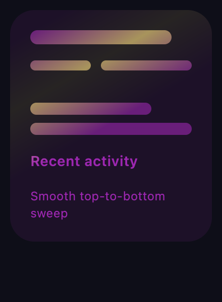
Shimmer custom gradient
play_arrowTry Online
import flet as ft


def _stat_block(title: str, subtitle: str) -> ft.Control:
    def metric(width: int, height: int = 14) -> ft.Control:
        return ft.Container(
            width=width,
            height=height,
            bgcolor=ft.Colors.WHITE,
            opacity=0.6,
            border_radius=ft.BorderRadius.all(height),
        )

    return ft.Container(
        width=200,
        padding=ft.Padding.all(20),
        bgcolor=ft.Colors.with_opacity(0.1, ft.Colors.BLACK),
        border_radius=ft.BorderRadius.all(24),
        content=ft.Column(
            spacing=16,
            controls=[
                metric(140),
                ft.Row(spacing=10, controls=[metric(60, 10), metric(90, 10)]),
                ft.Container(
                    border_radius=ft.BorderRadius.all(16),
                    bgcolor=ft.Colors.WHITE,
                    opacity=0.35,
                ),
                ft.Column(spacing=8, controls=[metric(120, 12), metric(160, 12)]),
                ft.Text(title, weight=ft.FontWeight.W_600),
                ft.Text(subtitle, size=12),
            ],
        ),
    )


def main(page: ft.Page):
    page.title = "Shimmer - custom gradients"
    page.bgcolor = "#0e0e18"
    accent = ft.LinearGradient(
        begin=ft.Alignment(-1.0, -0.5),
        end=ft.Alignment(1.0, 0.5),
        colors=[
            ft.Colors.PURPLE,
            ft.Colors.PURPLE,
            ft.Colors.AMBER_200,
            ft.Colors.PURPLE,
            ft.Colors.PURPLE,
        ],
        stops=[0.0, 0.35, 0.5, 0.65, 1.0],
    )

    cards = ft.Row(
        wrap=True,
        controls=[
            ft.Shimmer(
                gradient=accent,
                direction=ft.ShimmerDirection.TTB,
                period=2200,
                content=_stat_block("Recent activity", "Smooth top-to-bottom sweep"),
            ),
        ],
    )

    page.add(ft.SafeArea(content=cards))


if __name__ == "__main__":
    ft.run(main)
Properties
base_colorclass-attributeinstance-attribute
base_color: ColorValue | None = NoneBase color used when no gradient is provided.
contentinstance-attribute
content: ControlThe control to render with the shimmer effect.
Raises:
- ValueError - If it is not visible.
directionclass-attributeinstance-attribute
direction: ShimmerDirection = ShimmerDirection.LTRDirection of the shimmering animation.
gradientclass-attributeinstance-attribute
gradient: Gradient | None = NoneCustom gradient that defines the shimmer colors.
highlight_colorclass-attributeinstance-attribute
highlight_color: ColorValue | None = NoneHighlight color used when no gradient is provided.
loopclass-attributeinstance-attribute
loop: int | None = 0Number of times the animation should repeat. 0 means infinite.
Raises:
- ValueError - If it is not greater than or equal to
0.
periodclass-attributeinstance-attribute
period: DurationValue = 1500Duration of a shimmer cycle in milliseconds.