DataTable
A Material Design data table.
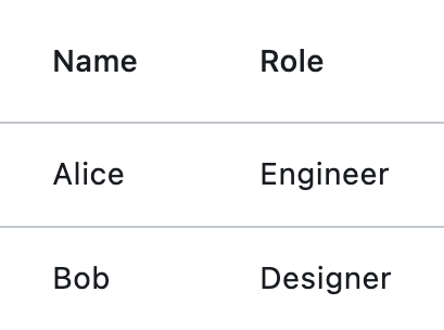
Example:
ft.DataTable(
    columns=[
        ft.DataColumn(label=ft.Text("Name")),
        ft.DataColumn(label=ft.Text("Role")),
    ],
    rows=[
        ft.DataRow(
            cells=[
                ft.DataCell(ft.Text("Alice")),
                ft.DataCell(ft.Text("Engineer")),
            ]
        ),
        ft.DataRow(
            cells=[
                ft.DataCell(ft.Text("Bob")),
                ft.DataCell(ft.Text("Designer")),
            ]
        ),
    ],
)
Outgrown this table? Its beefier cousin, DataTable2 (from the
flet-datatable2 extension package), adds sticky headers, fixed
rows/columns, per-column widths (fixed or relative S/M/L),
and a few other goodies — handy for large or wide datasets.
Inherits: LayoutControl
Properties
bgcolor- The background color for this table.border- The border around the table.border_radius- Border corners.checkbox_horizontal_margin- Horizontal margin around the checkbox, if it is displayed.clip_behavior- Defines how the contents of this table are clipped.column_spacing- The horizontal margin between the contents of each data column.columns- A list ofDataColumncontrols describing table columns.data_row_color- The background color for the data rows.data_row_max_height- The maximum height of each row (excluding the row that contains column headings).data_row_min_height- The minimum height of each row (excluding the row that contains column headings).data_text_style- The text style of the datarows.divider_thickness- The width of the divider that appears betweenrows.gradient- The background gradient of this table.heading_row_color- The background color for the heading row.heading_row_height- The height of the heading row.heading_text_style- The text style for the heading row.horizontal_lines- Set the color and width of horizontal lines between rows.horizontal_margin- The horizontal margin between the edges of this table and the content in the first and last cells of each row.rows- A list ofDataRowcontrols defining table rows.show_bottom_border- Whether a border at the bottom of the table is displayed.show_checkbox_column- Whether the control should display checkboxes for selectable rows.sort_ascending- Whether the column mentioned insort_column_index, if any, is sorted in ascending order.sort_column_index- The current primary sort key's column.vertical_lines- Set the color and width of vertical lines between columns.
Events
on_select_all- Invoked when the user selects or unselects every row, using the checkbox in the heading row.
Examples
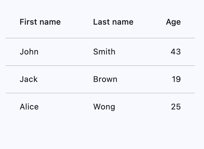
DataTable
import flet as ft


def main(page: ft.Page):
    page.add(
        ft.SafeArea(
            content=ft.DataTable(
                expand=True,
                columns=[
                    ft.DataColumn(label=ft.Text("First name")),
                    ft.DataColumn(label=ft.Text("Last name")),
                    ft.DataColumn(label=ft.Text("Age"), numeric=True),
                ],
                rows=[
                    ft.DataRow(
                        cells=[
                            ft.DataCell(ft.Text("John")),
                            ft.DataCell(ft.Text("Smith")),
                            ft.DataCell(ft.Text("43")),
                        ],
                    ),
                    ft.DataRow(
                        cells=[
                            ft.DataCell(ft.Text("Jack")),
                            ft.DataCell(ft.Text("Brown")),
                            ft.DataCell(ft.Text("19")),
                        ],
                    ),
                    ft.DataRow(
                        cells=[
                            ft.DataCell(ft.Text("Alice")),
                            ft.DataCell(ft.Text("Wong")),
                            ft.DataCell(ft.Text("25")),
                        ],
                    ),
                ],
            ),
        )
    )


if __name__ == "__main__":
    ft.run(main)
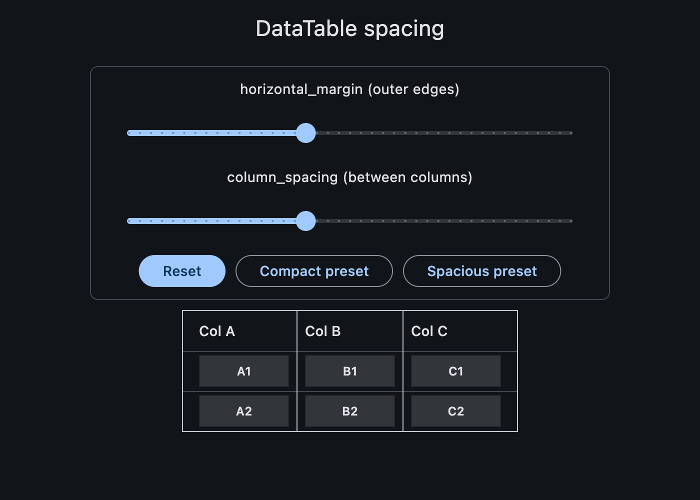
Horizontal margin and column spacing
Use horizontal_margin to control the left and right edge spacing of the first and last columns. Use column_spacing to control spacing between columns.
import flet as ft


def _cell(label: str, color: str = ft.Colors.SURFACE_CONTAINER_HIGHEST) -> ft.DataCell:
    return ft.DataCell(
        ft.Container(
            width=90,
            height=32,
            alignment=ft.Alignment.CENTER,
            bgcolor=color,
            border=ft.Border.all(1, ft.Colors.BLACK_26),
            content=ft.Text(label, size=12, weight=ft.FontWeight.W_600),
        )
    )


def main(page: ft.Page):
    page.scroll = ft.ScrollMode.AUTO
    page.horizontal_alignment = ft.CrossAxisAlignment.CENTER
    page.theme_mode = ft.ThemeMode.DARK

    def update_spacing() -> None:
        table.horizontal_margin = horizontal_margin_slider.value
        table.column_spacing = column_spacing_slider.value
        table.update()

    def handle_spacing_change(_: ft.Event[ft.Slider]) -> None:
        update_spacing()

    def set_preset(horizontal_margin: float, column_spacing: float) -> None:
        horizontal_margin_slider.value = horizontal_margin
        column_spacing_slider.value = column_spacing
        horizontal_margin_slider.update()
        column_spacing_slider.update()
        update_spacing()

    horizontal_margin_slider = ft.Slider(
        key="horizontal_margin_slider",
        min=0,
        max=40,
        divisions=40,
        value=16,
        label="{value}",
        on_change=handle_spacing_change,
    )
    column_spacing_slider = ft.Slider(
        key="column_spacing_slider",
        min=0,
        max=40,
        divisions=40,
        value=16,
        label="{value}",
        on_change=handle_spacing_change,
    )

    table = ft.DataTable(
        border=ft.Border.all(1, ft.Colors.ON_SURFACE_VARIANT),
        horizontal_margin=horizontal_margin_slider.value,
        column_spacing=column_spacing_slider.value,
        horizontal_lines=ft.BorderSide(1, ft.Colors.ON_SURFACE_VARIANT),
        vertical_lines=ft.BorderSide(1, ft.Colors.ON_SURFACE_VARIANT),
        heading_row_height=40,
        data_row_min_height=40,
        data_row_max_height=40,
        columns=[
            ft.DataColumn(label="Col A"),
            ft.DataColumn(label="Col B"),
            ft.DataColumn(label="Col C"),
        ],
        rows=[
            ft.DataRow(cells=[_cell("A1"), _cell("B1"), _cell("C1")]),
            ft.DataRow(cells=[_cell("A2"), _cell("B2"), _cell("C2")]),
        ],
    )

    page.appbar = ft.AppBar(title="DataTable spacing")
    page.add(
        ft.SafeArea(
            content=ft.Column(
                horizontal_alignment=ft.CrossAxisAlignment.CENTER,
                controls=[
                    ft.Container(
                        width=520,
                        padding=12,
                        border=ft.Border.all(1, ft.Colors.OUTLINE_VARIANT),
                        border_radius=8,
                        content=ft.Column(
                            horizontal_alignment=ft.CrossAxisAlignment.CENTER,
                            controls=[
                                ft.Text("horizontal_margin (outer edges)"),
                                horizontal_margin_slider,
                                ft.Text("column_spacing (between columns)"),
                                column_spacing_slider,
                                ft.Row(
                                    wrap=True,
                                    controls=[
                                        ft.FilledButton(
                                            "Reset",
                                            on_click=lambda _: set_preset(16, 16),
                                        ),
                                        ft.OutlinedButton(
                                            "Compact preset",
                                            on_click=lambda _: set_preset(0, 0),
                                        ),
                                        ft.OutlinedButton(
                                            "Spacious preset",
                                            on_click=lambda _: set_preset(24, 32),
                                        ),
                                    ],
                                ),
                            ],
                        ),
                    ),
                    table,
                ],
            ),
        )
    )


if __name__ == "__main__":
    ft.run(main)
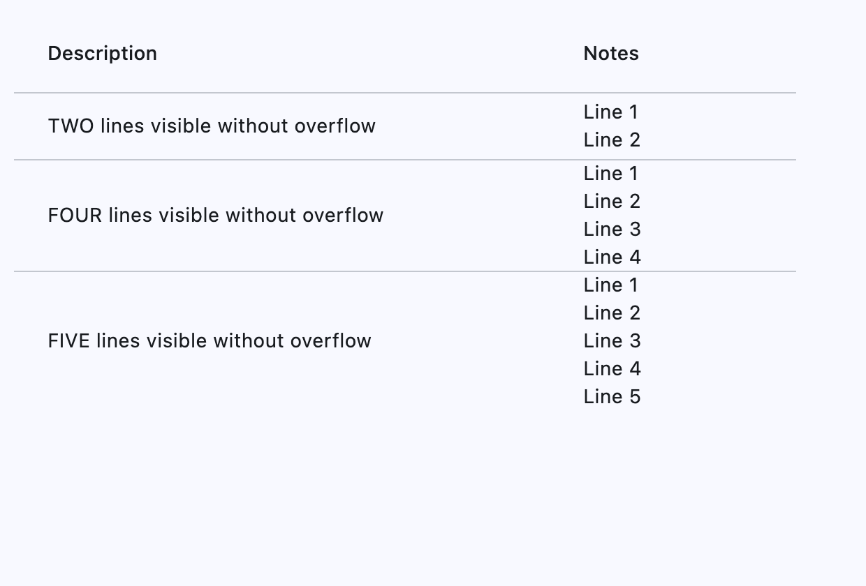
Adaptive row heights
Setting data_row_max_height to float('inf') (infinity) will cause the DataTable to let each individual row adapt its height to its respective content, instead of all rows having the same height.
import flet as ft


def main(page: ft.Page):
    page.add(
        ft.SafeArea(
            content=ft.DataTable(
                width=560,
                data_row_min_height=48,
                data_row_max_height=float("inf"),
                columns=[
                    ft.DataColumn(label="Description"),
                    ft.DataColumn(label="Notes"),
                ],
                rows=[
                    ft.DataRow(
                        cells=[
                            ft.DataCell("TWO lines visible without overflow"),
                            ft.DataCell("Line 1\nLine 2"),
                        ],
                    ),
                    ft.DataRow(
                        cells=[
                            ft.DataCell("FOUR lines visible without overflow"),
                            ft.DataCell("Line 1\nLine 2\nLine 3\nLine 4"),
                        ],
                    ),
                    ft.DataRow(
                        cells=[
                            ft.DataCell("FIVE lines visible without overflow"),
                            ft.DataCell("Line 1\nLine 2\nLine 3\nLine 4\nLine 5"),
                        ],
                    ),
                ],
            ),
        )
    )


if __name__ == "__main__":
    ft.run(main)
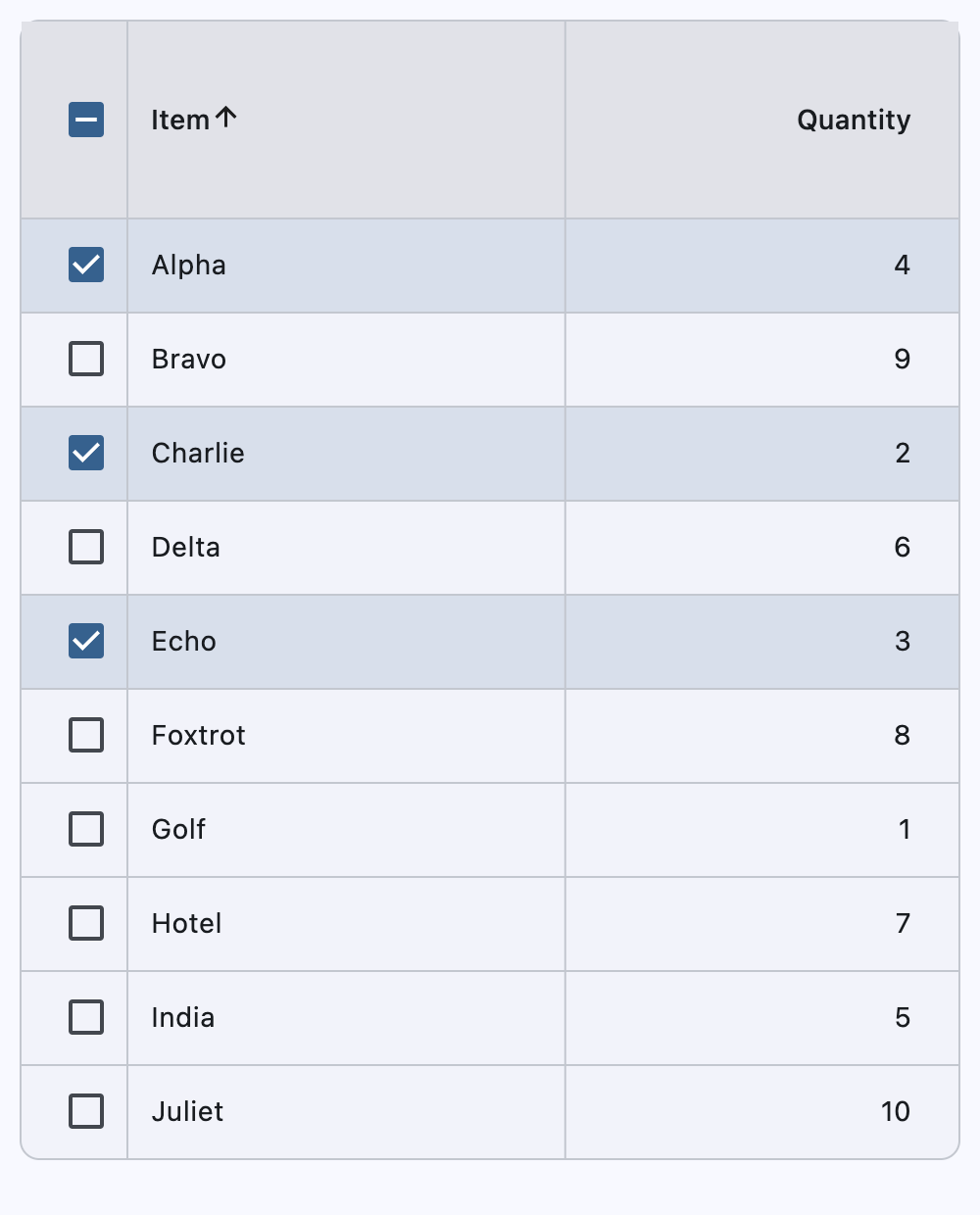
Sortable columns and selectable rows
This example demonstrates row selection (including select-all), sortable string and numeric columns, and stable selection across sorts and refreshes.
import flet as ft


def main(page: ft.Page):
    page.scroll = ft.ScrollMode.AUTO
    inventory_items = [
        {"id": 1, "name": "Alpha", "qty": 4},
        {"id": 2, "name": "Bravo", "qty": 9},
        {"id": 3, "name": "Charlie", "qty": 2},
        {"id": 4, "name": "Delta", "qty": 6},
        {"id": 5, "name": "Echo", "qty": 3},
        {"id": 6, "name": "Foxtrot", "qty": 8},
        {"id": 7, "name": "Golf", "qty": 1},
        {"id": 8, "name": "Hotel", "qty": 7},
        {"id": 9, "name": "India", "qty": 5},
        {"id": 10, "name": "Juliet", "qty": 10},
    ]
    displayed_items = list(inventory_items)
    selected_item_ids: set[int] = {1, 3, 5}

    sort_key_for_column = {
        0: lambda item: str(item["name"]).lower(),
        1: lambda item: int(item["qty"]),
    }

    def build_rows(items: list[dict[str, int | str]]) -> list[ft.DataRow]:
        return [
            ft.DataRow(
                selected=item["id"] in selected_item_ids,
                on_select_change=handle_row_selection_change,
                data=item["id"],
                cells=[
                    ft.DataCell(ft.Text(item["name"])),
                    ft.DataCell(ft.Text(str(item["qty"]))),
                ],
            )
            for item in items
        ]

    def refresh_table_rows() -> None:
        table.rows = build_rows(displayed_items)
        table.update()

    def handle_row_selection_change(e: ft.Event[ft.DataRow]) -> None:
        row = e.control
        item_id = row.data
        is_selected = e.data

        if is_selected:
            selected_item_ids.add(item_id)
        else:
            selected_item_ids.discard(item_id)

        row.selected = is_selected
        row.update()

    def handle_select_all(e: ft.Event[ft.DataTable]) -> None:
        if e.data:
            selected_item_ids.update(int(item["id"]) for item in displayed_items)
        else:
            selected_item_ids.clear()

        refresh_table_rows()

    def handle_column_sort(e: ft.DataColumnSortEvent) -> None:
        displayed_items.sort(
            key=sort_key_for_column[e.column_index],
            reverse=not e.ascending,
        )

        table.sort_column_index = e.column_index
        table.sort_ascending = e.ascending
        refresh_table_rows()

    table = ft.DataTable(
        width=700,
        bgcolor=ft.Colors.SURFACE_CONTAINER_LOW,
        border=ft.Border.all(1, ft.Colors.OUTLINE_VARIANT),
        border_radius=10,
        vertical_lines=ft.border.BorderSide(1, ft.Colors.OUTLINE_VARIANT),
        horizontal_lines=ft.border.BorderSide(1, ft.Colors.OUTLINE_VARIANT),
        sort_column_index=0,
        sort_ascending=True,
        heading_row_color=ft.Colors.SURFACE_CONTAINER_HIGHEST,
        heading_row_height=100,
        data_row_color={
            ft.ControlState.HOVERED: ft.Colors.with_opacity(0.08, ft.Colors.PRIMARY),
            ft.ControlState.SELECTED: ft.Colors.with_opacity(0.14, ft.Colors.PRIMARY),
        },
        show_checkbox_column=True,
        on_select_all=handle_select_all,
        divider_thickness=1,
        column_spacing=200,
        columns=[
            ft.DataColumn(
                label=ft.Text("Item"),
                on_sort=handle_column_sort,
            ),
            ft.DataColumn(
                label=ft.Text("Quantity"),
                tooltip="Numeric quantity",
                numeric=True,
                on_sort=handle_column_sort,
            ),
        ],
        rows=build_rows(displayed_items),
    )

    page.add(
        ft.SafeArea(
            content=table,
        )
    )


if __name__ == "__main__":
    ft.run(main)
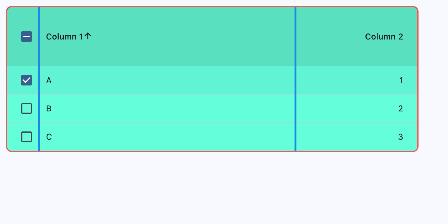
Handling events
import flet as ft


def main(page: ft.Page):
    def handle_row_selection_change(e: ft.Event[ft.DataRow]) -> None:
        if e.control.data == 1:
            row1.selected = not row1.selected
        elif e.control.data == 2:
            row2.selected = not row2.selected
        elif e.control.data == 3:
            row3.selected = not row3.selected

        table.update()

    def handle_column_sort(e: ft.DataColumnSortEvent) -> None:
        if e.control.data in [1, 2]:
            print(f"{e.column_index}, {e.ascending}")
            table.sort_ascending = e.ascending
            table.update()

    table = ft.DataTable(
        width=700,
        bgcolor=ft.Colors.TEAL_ACCENT_200,
        border=ft.Border.all(2, ft.Colors.RED_ACCENT_200),
        border_radius=10,
        vertical_lines=ft.border.BorderSide(3, ft.Colors.BLUE_600),
        horizontal_lines=ft.border.BorderSide(1, ft.Colors.GREEN_600),
        sort_column_index=0,
        sort_ascending=True,
        heading_row_color=ft.Colors.BLACK_12,
        heading_row_height=100,
        data_row_color={ft.ControlState.HOVERED: "0x30FF0000"},
        show_checkbox_column=True,
        divider_thickness=0,
        column_spacing=200,
        columns=[
            ft.DataColumn(
                label=ft.Text("Column 1"),
                tooltip="This is the first column",
                data=1,
                on_sort=handle_column_sort,
            ),
            ft.DataColumn(
                label=ft.Text("Column 2"),
                tooltip="This is a second column",
                numeric=True,
                data=2,
                on_sort=handle_column_sort,
            ),
        ],
        rows=[
            row1 := ft.DataRow(
                cells=[ft.DataCell(ft.Text("A")), ft.DataCell(ft.Text("1"))],
                selected=True,
                on_select_change=handle_row_selection_change,
                data=1,
            ),
            row2 := ft.DataRow(
                cells=[ft.DataCell(ft.Text("B")), ft.DataCell(ft.Text("2"))],
                selected=False,
                on_select_change=handle_row_selection_change,
                data=2,
            ),
            row3 := ft.DataRow(
                cells=[ft.DataCell(ft.Text("C")), ft.DataCell(ft.Text("3"))],
                selected=False,
                on_select_change=handle_row_selection_change,
                data=3,
            ),
        ],
    )

    page.add(
        ft.SafeArea(
            content=table,
        )
    )


if __name__ == "__main__":
    ft.run(main)
Properties
bgcolorclass-attributeinstance-attribute
bgcolor: ColorValue | None = NoneThe background color for this table.
border_radiusclass-attributeinstance-attribute
border_radius: BorderRadiusValue | None = NoneBorder corners.
checkbox_horizontal_marginclass-attributeinstance-attribute
checkbox_horizontal_margin: Number | None = NoneHorizontal margin around the checkbox, if it is displayed.
clip_behaviorclass-attributeinstance-attribute
clip_behavior: ClipBehavior = ClipBehavior.NONEDefines how the contents of this table are clipped.
column_spacingclass-attributeinstance-attribute
column_spacing: Number | None = NoneThe horizontal margin between the contents of each data column.
columnsinstance-attribute
columns: list[DataColumn]A list of DataColumn controls describing table columns.
Raises:
- ValueError - If there are no visible
columns.
data_row_colorclass-attributeinstance-attribute
data_row_color: ControlStateValue[ColorValue] | None = NoneThe background color for the data rows.
The effective background color can be made to depend on the
ControlState state, i.e. if the row is selected, pressed, hovered,
focused, disabled or enabled. The color is painted as an overlay to the row.
To make sure that the row's InkWell is visible (when pressed, hovered and focused),
it is recommended to use a translucent background color.
data_row_max_heightclass-attributeinstance-attribute
data_row_max_height: Number | None = NoneThe maximum height of each row (excluding the row that contains column headings).
Set to float("inf") for the height of each row to adjust automatically with its
content.
Defaults to 48.0.
Raises:
- ValueError - If it is not greater than or equal to
data_row_min_height.
data_row_min_heightclass-attributeinstance-attribute
data_row_min_height: Number | None = NoneThe minimum height of each row (excluding the row that contains column headings).
Defaults to 48.0.
Raises:
- ValueError - If it is not less than or equal to
data_row_max_height.
data_text_styleclass-attributeinstance-attribute
data_text_style: TextStyle | None = NoneThe text style of the data rows.
divider_thicknessclass-attributeinstance-attribute
divider_thickness: Number = 1.0The width of the divider that appears between rows.
Raises:
- ValueError - If it is not greater than or equal to
0.
gradientclass-attributeinstance-attribute
gradient: Gradient | None = NoneThe background gradient of this table.
heading_row_colorclass-attributeinstance-attribute
heading_row_color: ControlStateValue[ColorValue] | None = (
    None
)
The background color for the heading row.
The effective background color can be made to depend on the
ControlState state, i.e. if the row is pressed, hovered,
focused when sorted. The color is painted as an overlay to the row. To make sure
that the row's InkWell is visible (when pressed, hovered and focused), it is
recommended to use a translucent color.
heading_row_heightclass-attributeinstance-attribute
heading_row_height: Number | None = NoneThe height of the heading row.
heading_text_styleclass-attributeinstance-attribute
heading_text_style: TextStyle | None = NoneThe text style for the heading row.
horizontal_linesclass-attributeinstance-attribute
horizontal_lines: BorderSide | None = NoneSet the color and width of horizontal lines between rows.
horizontal_marginclass-attributeinstance-attribute
horizontal_margin: Number | None = NoneThe horizontal margin between the edges of this table and the content in the first and last cells of each row.
When a checkbox is displayed, it is also the margin between the checkbox the content in the first data column.
rowsclass-attributeinstance-attribute
rows: list[DataRow] = field(default_factory=list)A list of DataRow controls defining table rows.
show_bottom_borderclass-attributeinstance-attribute
show_bottom_border: bool = FalseWhether a border at the bottom of the table is displayed.
By default, a border is not shown at the bottom to allow for a border around the table defined by decoration.
show_checkbox_columnclass-attributeinstance-attribute
show_checkbox_column: bool = FalseWhether the control should display checkboxes for selectable rows.
If True, a checkbox will be placed at the beginning of each row that is
selectable. However, if DataRow.on_select_change
is not set for any row, checkboxes will not be placed, even if this value is True.
If False, all rows will not display a checkbox.
sort_ascendingclass-attributeinstance-attribute
sort_ascending: bool = FalseWhether the column mentioned in sort_column_index, if any, is sorted in ascending order.
If True, the order is ascending (meaning the rows with the smallest values for
the current sort column are first in the table).
If False, the order is descending (meaning the rows with the smallest values for
the current sort column are last in the table).
sort_column_indexclass-attributeinstance-attribute
sort_column_index: int | None = NoneThe current primary sort key's column.
If specified, indicates that the indicated column is the column by which the data
is sorted. The number must correspond to the index of the relevant column in
columns.
Setting this will cause the relevant column to have a sort indicator displayed.
When this is None, it implies that the table's sort order does not correspond to
any of the columns.
Raises:
- ValueError - If it is out of range relative to the visible
columns.
vertical_linesclass-attributeinstance-attribute
vertical_lines: BorderSide | None = NoneSet the color and width of vertical lines between columns.
Events
on_select_allclass-attributeinstance-attribute
on_select_all: ControlEventHandler[DataTable] | None = NoneInvoked when the user selects or unselects every row, using the checkbox in the heading row.
If this is None, then the DataRow.on_select_change
callback of every rows of this table is invoked appropriately instead.
To control whether a particular row is selectable or not, see
DataRow.on_select_change. This callback is only relevant if
any row is selectable.