Stack
Positions its children on top of each other, following a LIFO (Last In First Out) order.
This control is useful if you want to overlap several children in a simple way. For example having some text and an image, overlaid with a gradient and a button attached to the bottom.
Stack is also useful if you want to implement implicit animations (https://flet.dev/docs/cookbook/animations) that require knowing absolute position of a target value.
Example:
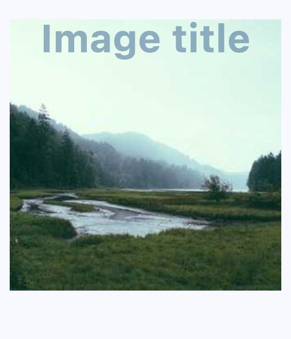
ft.Stack(
        width=300,
        height=300,
        controls=[
            ft.Image(
                src="https://picsum.photos/300/300",
                width=300,
                height=300,
                fit=ft.BoxFit.CONTAIN,
            ),
            ft.Row(
                alignment=ft.MainAxisAlignment.CENTER,
                controls=[
                    ft.Text(
                        value="Image title",
                        color=ft.Colors.SURFACE_TINT,
                        size=40,
                        weight=ft.FontWeight.BOLD,
                        opacity=0.5,
                    )
                ],
            ),
        ],
    )
Inherits: LayoutControl, AdaptiveControl
Properties
alignment- Specifies the alignment for non-positioned (those without explicit alignment properties such asLayoutControl.toporLayoutControl.bottom) and partially-positionedcontrols.clip_behavior- The content will be clipped (or not) according to this option.controls- A list of Controls to display.fit- How to size the non-positionedcontrols.
Examples
Online avatar
import flet as ft


def main(page: ft.Page):
    page.add(
        ft.SafeArea(
            content=ft.Stack(
                width=40,
                height=40,
                controls=[
                    ft.CircleAvatar(
                        foreground_image_src="https://avatars.githubusercontent.com/u/5041459?s=88&v=4"
                    ),
                    ft.Container(
                        alignment=ft.Alignment.BOTTOM_LEFT,
                        content=ft.CircleAvatar(bgcolor=ft.Colors.GREEN, radius=5),
                    ),
                ],
            ),
        )
    )


if __name__ == "__main__":
    ft.run(main)
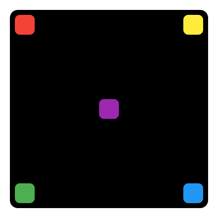
Absolute positioning
import flet as ft


def main(page: ft.Page):
    page.horizontal_alignment = ft.CrossAxisAlignment.CENTER
    page.vertical_alignment = ft.MainAxisAlignment.CENTER

    page.add(
        ft.SafeArea(
            content=ft.Container(
                border_radius=8,
                padding=5,
                width=200,
                height=200,
                bgcolor=ft.Colors.BLACK,
                content=ft.Stack(
                    controls=[
                        ft.Container(
                            width=20,
                            height=20,
                            bgcolor=ft.Colors.RED,
                            border_radius=5,
                        ),
                        ft.Container(
                            width=20,
                            height=20,
                            bgcolor=ft.Colors.YELLOW,
                            border_radius=5,
                            right=0,
                        ),
                        ft.Container(
                            width=20,
                            height=20,
                            bgcolor=ft.Colors.BLUE,
                            border_radius=5,
                            right=0,
                            bottom=0,
                        ),
                        ft.Container(
                            width=20,
                            height=20,
                            bgcolor=ft.Colors.GREEN,
                            border_radius=5,
                            left=0,
                            bottom=0,
                        ),
                        ft.Column(
                            left=85,
                            top=85,
                            controls=[
                                ft.Container(
                                    width=20,
                                    height=20,
                                    bgcolor=ft.Colors.PURPLE,
                                    border_radius=5,
                                )
                            ],
                        ),
                    ]
                ),
            ),
        )
    )


if __name__ == "__main__":
    ft.run(main)
Properties
alignmentclass-attributeinstance-attribute
alignment: Alignment | None = NoneSpecifies the alignment for non-positioned (those without explicit alignment properties such as LayoutControl.top
or LayoutControl.bottom) and
partially-positioned controls.
clip_behaviorclass-attributeinstance-attribute
clip_behavior: ClipBehavior = ClipBehavior.HARD_EDGEThe content will be clipped (or not) according to this option.
controlsclass-attributeinstance-attribute
controls: list[Control] = field(default_factory=list)A list of Controls to display.
For the display order, it follows the order of the list, so the last control in the list will be displayed on top (LIFO - Last In First Out).
fitclass-attributeinstance-attribute
fit: StackFit = StackFit.LOOSEHow to size the non-positioned controls.