Tabs
Used for navigating frequently accessed, distinct content categories. Tabs allow for navigation between two or more content views and relies on text headers to articulate the different sections of content.
Example:
ft.Tabs(
    length=2,
    expand=True,
    content=ft.Column(
        expand=True,
        controls=[
            ft.TabBar(
                tabs=[
                    ft.Tab(label="Overview"),
                    ft.Tab(label="Settings", icon=ft.Icons.SETTINGS),
                ]
            ),
            ft.TabBarView(
                expand=True,
                controls=[
                    ft.Container(
                        alignment=ft.Alignment.CENTER,
                        content=ft.Text("Overview content"),
                    ),
                    ft.Container(
                        alignment=ft.Alignment.CENTER,
                        content=ft.Text("Settings content"),
                    ),
                ],
            ),
        ],
    ),
)
Inherits: LayoutControl, AdaptiveControl
Properties
animation_duration- The duration of tab animations.content- The content to display.length- The total number of tabs.selected_index- The index of the currently selected tab.
Events
on_change- Called whenselected_indexchanges.
Methods
move_to- Selects the tab at the givenindex.
Examples
Tabs
import flet as ft
def main(page: ft.Page):
page.add(
ft.SafeArea(
expand=True,
content=ft.Tabs(
selected_index=1,
length=3,
expand=True,
content=ft.Column(
expand=True,
controls=[
ft.TabBar(
tabs=[
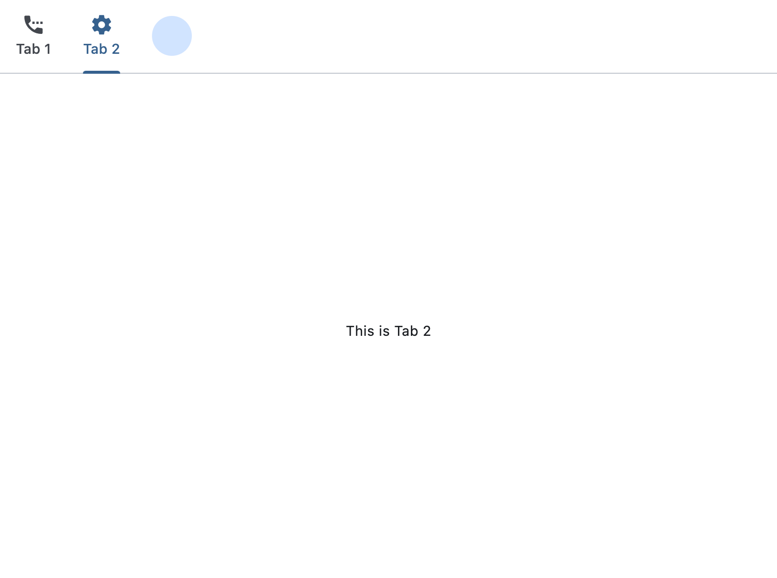
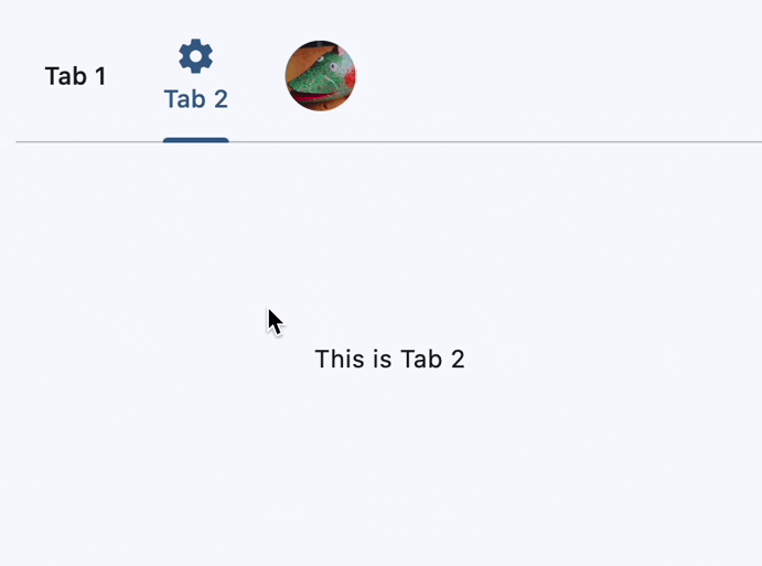
ft.Tab(label="Tab 1", icon=ft.Icons.SETTINGS_PHONE),
ft.Tab(label="Tab 2", icon=ft.Icons.SETTINGS),
ft.Tab(
label=ft.CircleAvatar(
foreground_image_src="https://avatars.githubusercontent.com/u/102273996?s=200&v=4",
),
),
]
),
ft.TabBarView(
expand=True,
controls=[
ft.Container(
alignment=ft.Alignment.CENTER,
content=ft.Text("This is Tab 1"),
),
ft.Container(
alignment=ft.Alignment.CENTER,
content=ft.Text("This is Tab 2"),
),
ft.Container(
alignment=ft.Alignment.CENTER,
content=ft.Text("This is Tab 3"),
),
],
),
],
),
),
)
)
if __name__ == "__main__":
ft.run(main)
Nested tabs
import flet as ft


def main(page: ft.Page):
    page.add(
        ft.SafeArea(
            expand=True,
            content=ft.Tabs(
                length=2,
                selected_index=1,
                expand=True,
                content=ft.Column(
                    expand=True,
                    controls=[
                        ft.TabBar(
                            tabs=[
                                ft.Tab(label=ft.Text("Main Tab 1")),
                                ft.Tab(label=ft.Text("Main Tab 2")),
                            ],
                        ),
                        ft.TabBarView(
                            expand=True,
                            controls=[
                                ft.Text("Main Tab 1 content"),
                                ft.Tabs(
                                    length=2,
                                    expand=True,
                                    content=ft.Column(
                                        expand=True,
                                        controls=[
                                            ft.TabBar(
                                                secondary=True,
                                                tabs=[
                                                    ft.Tab(label=ft.Text("SubTab 1")),
                                                    ft.Tab(label=ft.Text("SubTab 2")),
                                                ],
                                            ),
                                            ft.TabBarView(
                                                expand=True,
                                                controls=[
                                                    ft.Text("Nested Tab 1 content"),
                                                    ft.Text("Nested Tab 2 content"),
                                                ],
                                            ),
                                        ],
                                    ),
                                ),
                            ],
                        ),
                    ],
                ),
            ),
        )
    )


if __name__ == "__main__":
    ft.run(main)
Dynamic tab addition
import flet as ft


@ft.control
class MyContainer(ft.Container):
    text: str = ""
    height: int = 100
    alignment: ft.Alignment = ft.Alignment.CENTER

    def init(self):
        self.bgcolor = ft.Colors.random()
        self.content = ft.Text(self.text)


def main(page: ft.Page):
    def handle_new_tab(e: ft.Event[ft.CupertinoFilledButton]):
        tab_count = len(tab_bar.tabs) + 1
        tab_bar.tabs.append(ft.Tab(label=ft.Text(f"Tab {tab_count}")))
        tab_view.controls.append(MyContainer(text=f"Tab {tab_count} content"))
        tabs.length = len(tab_bar.tabs)

    tabs = ft.Tabs(
        length=2,
        expand=True,
        content=ft.Column(
            expand=True,
            controls=[
                tab_bar := ft.TabBar(
                    tab_alignment=ft.TabAlignment.CENTER,
                    tabs=[
                        ft.Tab(label=ft.Text("Tab 1")),
                        ft.Tab(label=ft.Text("Tab 2")),
                    ],
                ),
                ft.Row(
                    alignment=ft.MainAxisAlignment.CENTER,
                    controls=[
                        ft.CupertinoFilledButton(
                            content="Add New Tab",
                            icon=ft.Icons.ADD,
                            on_click=handle_new_tab,
                        ),
                    ],
                ),
                tab_view := ft.TabBarView(
                    expand=True,
                    controls=[
                        MyContainer(text="Tab 1 content"),
                        MyContainer(text="Tab 2 content"),
                    ],
                ),
            ],
        ),
    )

    page.add(
        ft.SafeArea(
            expand=True,
            content=tabs,
        )
    )


if __name__ == "__main__":
    ft.run(main)
Custom tab indicator
import flet as ft


def main(page: ft.Page):
    page.add(
        ft.SafeArea(
            expand=True,
            content=ft.Tabs(
                length=2,
                expand=True,
                content=ft.Column(
                    expand=True,
                    controls=[
                        ft.TabBar(
                            tab_alignment=ft.TabAlignment.START,
                            indicator_animation=ft.TabIndicatorAnimation.ELASTIC,
                            indicator_size=ft.TabBarIndicatorSize.LABEL,
                            indicator=ft.UnderlineTabIndicator(
                                border_side=ft.BorderSide(5, color=ft.Colors.RED),
                                border_radius=ft.BorderRadius.all(1),
                                insets=ft.Padding.only(bottom=5),
                            ),
                            tabs=[
                                ft.Tab(label=ft.Text("Home")),
                                ft.Tab(label=ft.Text("My Account")),
                            ],
                        ),
                        ft.TabBarView(
                            expand=True,
                            controls=[
                                ft.Text("Home Tab Content"),
                                ft.Text("Profile Tab Content"),
                            ],
                        ),
                    ],
                ),
            ),
        )
    )


if __name__ == "__main__":
    ft.run(main)
Programmatic tab switch
import random

import flet as ft


def main(page: ft.Page):
    async def handle_move_to_random(e: ft.Event[ft.FloatingActionButton]):
        # random index, excluding the current one
        i = random.choice([i for i in range(tabs.length) if i != tabs.selected_index])

        await tabs.move_to(
            index=i,
            animation_curve=ft.AnimationCurve.FAST_OUT_SLOWIN,
            animation_duration=ft.Duration(seconds=3),
        )

    page.floating_action_button = ft.FloatingActionButton(
        icon=ft.Icons.MOVE_UP,
        content="Move to a random tab",
        on_click=handle_move_to_random,
    )

    tabs = ft.Tabs(
        length=6,
        selected_index=5,
        expand=True,
        content=ft.Column(
            expand=True,
            controls=[
                ft.TabBar(
                    tab_alignment=ft.TabAlignment.CENTER,
                    tabs=[
                        ft.Tab(label=ft.Text("Tab 1")),
                        ft.Tab(label=ft.Text("Tab 2")),
                        ft.Tab(label=ft.Text("Tab 3")),
                        ft.Tab(label=ft.Text("Tab 4")),
                        ft.Tab(label=ft.Text("Tab 5")),
                        ft.Tab(label=ft.Text("Tab 6")),
                    ],
                ),
                ft.TabBarView(
                    expand=True,
                    controls=[
                        ft.Container(
                            alignment=ft.Alignment.CENTER,
                            content=ft.Text("Tab 1 content"),
                        ),
                        ft.Container(
                            alignment=ft.Alignment.CENTER,
                            content=ft.Text("Tab 2 content"),
                        ),
                        ft.Container(
                            alignment=ft.Alignment.CENTER,
                            content=ft.Text("Tab 3 content"),
                        ),
                        ft.Container(
                            alignment=ft.Alignment.CENTER,
                            content=ft.Text("Tab 4 content"),
                        ),
                        ft.Container(
                            alignment=ft.Alignment.CENTER,
                            content=ft.Text("Tab 5 content"),
                        ),
                        ft.Container(
                            alignment=ft.Alignment.CENTER,
                            content=ft.Text("Tab 6 content"),
                        ),
                    ],
                ),
            ],
        ),
    )

    page.add(ft.SafeArea(expand=True, content=tabs))


if __name__ == "__main__":
    ft.run(main)
Properties
animation_durationclass-attributeinstance-attribute
animation_duration: DurationValue = field(
    default_factory=lambda: Duration(milliseconds=100)
)
The duration of tab animations. For example, the animation that occurs when the selected tab changes.
lengthinstance-attribute
length: intThe total number of tabs.
Typically greater than one.
Must match the length of both TabBar.tabs
and TabBarView.controls. Don't forget to update
it when adding/removing tabs.
Raises:
- ValueError - If it is not greater than or equal to
0.
selected_indexclass-attributeinstance-attribute
selected_index: int = 0The index of the currently selected tab.
Supports Python-style negative indexing, where -1 represents the last tab,
-2 the second to last, and so on.
- Must be in range
[-length, length - 1]. - Changing the value of this property will internally trigger
move_towithanimation_durationandAnimationCurve.EASEanimation curve. To specify a different animation curve or duration for this particular change, usemove_todirectly.
Raises:
- IndexError - If it is not in the range
[-length, length - 1].
Events
on_changeclass-attributeinstance-attribute
on_change: ControlEventHandler[Tabs] | None = NoneCalled when selected_index changes.
The data property of the event handler argument
contains the index of the selected tab.
Methods
move_toasync
move_to(
    index: int,
    animation_curve: AnimationCurve = AnimationCurve.EASE_IN,
    animation_duration: DurationValue | None = None,
)
Selects the tab at the given index.
Additionally, it triggers on_change event and updates
selected_index.
If index is negative, it is interpreted as a Python-style negative index
(e.g., -1 refers to the last tab). If the resolved index is already the
currently selected tab, the method returns immediately and does nothing.
Parameters:
- index (int) - The index of the tab to select. Must be between in range
[-length, length - 1]. - animation_curve (AnimationCurve, default:
AnimationCurve.EASE_IN) - The curve to apply to the animation. - animation_duration (DurationValue | None, default:
None) - The duration of the animation. IfNone(the default),Tabs.animation_durationwill be used.
Raises:
- IndexError - If the
indexis outside the range[-length, length - 1].