ExpansionPanel
A material expansion panel. It can either be expanded or collapsed. Its body is only visible when it is expanded.
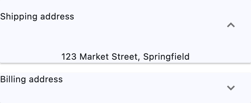
Example:
ft.ExpansionPanelList(
    width=400,
    controls=[
        ft.ExpansionPanel(
            header=ft.Text("Shipping address"),
            content=ft.Text("123 Market Street, Springfield"),
            expanded=True,
        ),
        ft.ExpansionPanel(
            header=ft.Text("Billing address"),
            content=ft.Text("Same as shipping"),
        ),
    ],
)
Inherits: LayoutControl, AdaptiveControl
Properties
bgcolor- The background color of this panel.can_tap_header- Whether tapping on this panel'sheaderwill expand or collapse it.content- The control to be found in the body of this panel.expanded- Whether this panel is in expanded (True) or collapsed (False) state.header- The control to be found in the header of this panel.highlight_color- Defines the highlight color of this panel ifcan_tap_headerisTrue, or the highlight color of the expand/collapseIconButtonifcan_tap_headerisFalse.splash_color- Defines the splash color of this panel ifcan_tap_headerisTrue, or the splash color of the expand/collapseIconButtonifcan_tap_headerisFalse.
Properties
bgcolorclass-attributeinstance-attribute
bgcolor: ColorValue | None = NoneThe background color of this panel.
can_tap_headerclass-attributeinstance-attribute
can_tap_header: bool = FalseWhether tapping on this panel's header will expand or collapse it.
contentclass-attributeinstance-attribute
content: Control | None = NoneThe control to be found in the body of this panel.
It is displayed below the header when this panel is expanded.
If this property is None, this panel will have a placeholder Text as
content.
expandedclass-attributeinstance-attribute
expanded: bool = FalseWhether this panel is in expanded (True) or collapsed (False) state.
headerclass-attributeinstance-attribute
header: Control | None = NoneThe control to be found in the header of this panel.
It is always visible, regardless of whether this panel is expanded or collapsed.
If can_tap_header is True, tapping on this header will expand or
collapse this panel.
If this property is None, this panel will have a placeholder Text as
header.
highlight_colorclass-attributeinstance-attribute
highlight_color: ColorValue | None = NoneDefines the highlight color of this panel if can_tap_header is True, or the highlight color of the expand/collapse IconButton if can_tap_header is False.
If this is None, then the icon button will use its default highlight color
Theme.highlight_color, and this panel will use its default highlight
color Theme.highlight_color (if can_tap_header is True).
splash_colorclass-attributeinstance-attribute
splash_color: ColorValue | None = NoneDefines the splash color of this panel if can_tap_header is True, or the splash color of the expand/collapse IconButton if can_tap_header is False.
If can_tap_header is False, and Theme.use_material3 is
True, this field will be ignored, as IconButton.splash_color
will be ignored, and you should use highlight_color instead.
If this is None, then the icon button will use its default splash color
Theme.splash_color, and this panel will use its default splash color
Theme.splash_color (if can_tap_header is True).