ExpansionPanelList
A material expansion panel list that lays out its children and animates expansions.
Example:
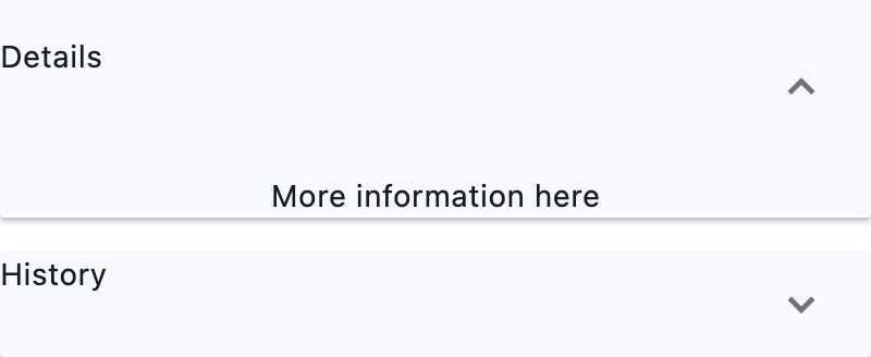
ft.ExpansionPanelList(
    width=400,
    controls=[
        ft.ExpansionPanel(
            header=ft.Text("Details"),
            content=ft.Text("More information here"),
            expanded=True,
        ),
        ft.ExpansionPanel(
            header=ft.Text("History"),
            content=ft.Text("View previous updates"),
        ),
    ],
)
Inherits: LayoutControl, ScrollableControl
Properties
controls- A list of panels to display.divider_color- The color of the divider whenExpansionPanel.expandedisFalse.elevation- Defines the elevation of thecontrols, when expanded.expand_icon_color- The color of the icon.expanded_header_padding- Defines the padding around the header when expanded.spacing- The size of the gap between thecontrolss when expanded.
Events
Examples
ExpansionPanelList
play_arrowTry Online
import flet as ft
def main(page: ft.Page):
page.theme_mode = ft.ThemeMode.LIGHT
def handle_change(e: ft.Event[ft.ExpansionPanelList]):
print(f"change on panel with index {e.data}")
def handle_delete(e: ft.Event[ft.IconButton]):
icon_button = e.control
tile = icon_button.parent
panel = tile.parent
panel_list.controls.remove(panel)
panel_list.update()
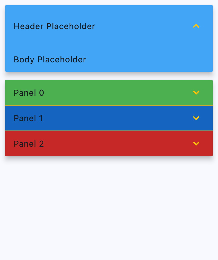
panel_list = ft.ExpansionPanelList(
expand_icon_color=ft.Colors.AMBER,
elevation=8,
divider_color=ft.Colors.AMBER,
on_change=handle_change,
controls=[
ft.ExpansionPanel(
bgcolor=ft.Colors.BLUE_400,
expanded=True,
),
],
)
colors = [
ft.Colors.GREEN_500,
ft.Colors.BLUE_800,
ft.Colors.RED_800,
]
for i, bgcolor in enumerate(colors):
panel_list.controls.append(
ft.ExpansionPanel(
bgcolor=bgcolor,
header=ft.ListTile(title=ft.Text(f"Panel {i}"), bgcolor=bgcolor),
content=ft.ListTile(
bgcolor=bgcolor,
title=ft.Text(f"This is in Panel {i}"),
subtitle=ft.Text(f"Press the icon to delete panel {i}"),
trailing=ft.IconButton(
icon=ft.Icons.DELETE,
on_click=handle_delete,
),
),
)
)
page.add(
ft.SafeArea(
content=panel_list,
)
)
if __name__ == "__main__":
ft.run(main)
Scrolling
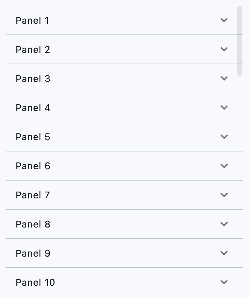
ExpansionPanelList supports scrolling through its scroll property.
play_arrowTry Online
import flet as ft


def main(page: ft.Page):
    page.add(
        ft.SafeArea(
            expand=True,
            content=ft.ExpansionPanelList(
                expand=True,
                scroll=ft.ScrollMode.ALWAYS,
                spacing=8,
                controls=[
                    ft.ExpansionPanel(
                        can_tap_header=True,
                        header=ft.ListTile(title=ft.Text(f"Panel {i}")),
                        content=ft.ListTile(
                            title=ft.Text(f"Details for panel {i}"),
                            subtitle=ft.Text(
                                "This content can be expanded or collapsed."
                            ),
                        ),
                    )
                    for i in range(1, 41)
                ],
            ),
        ),
    )


if __name__ == "__main__":
    ft.run(main)
Properties
controlsclass-attributeinstance-attribute
controls: list[ExpansionPanel] = field(default_factory=list)A list of panels to display.
divider_colorclass-attributeinstance-attribute
divider_color: ColorValue | None = NoneThe color of the divider when ExpansionPanel.expanded is False.
elevationclass-attributeinstance-attribute
elevation: Number = 2Defines the elevation of the controls, when expanded.
Raises:
- ValueError - If it is not greater than or equal to
0.
expand_icon_colorclass-attributeinstance-attribute
expand_icon_color: ColorValue | None = NoneThe color of the icon.
Defaults to Colors.BLACK_54 in light theme mode and
Colors.WHITE_60 in dark theme mode.
expanded_header_paddingclass-attributeinstance-attribute
expanded_header_padding: PaddingValue = field(
    default_factory=lambda: Padding.symmetric(vertical=16.0)
)
Defines the padding around the header when expanded.
Events
on_changeclass-attributeinstance-attribute
on_change: (
    EventHandler[ExpansionPanelListChangeEvent] | None
) = None
Called when an item of controls is expanded or collapsed.