CupertinoTextField
An iOS-style text field.
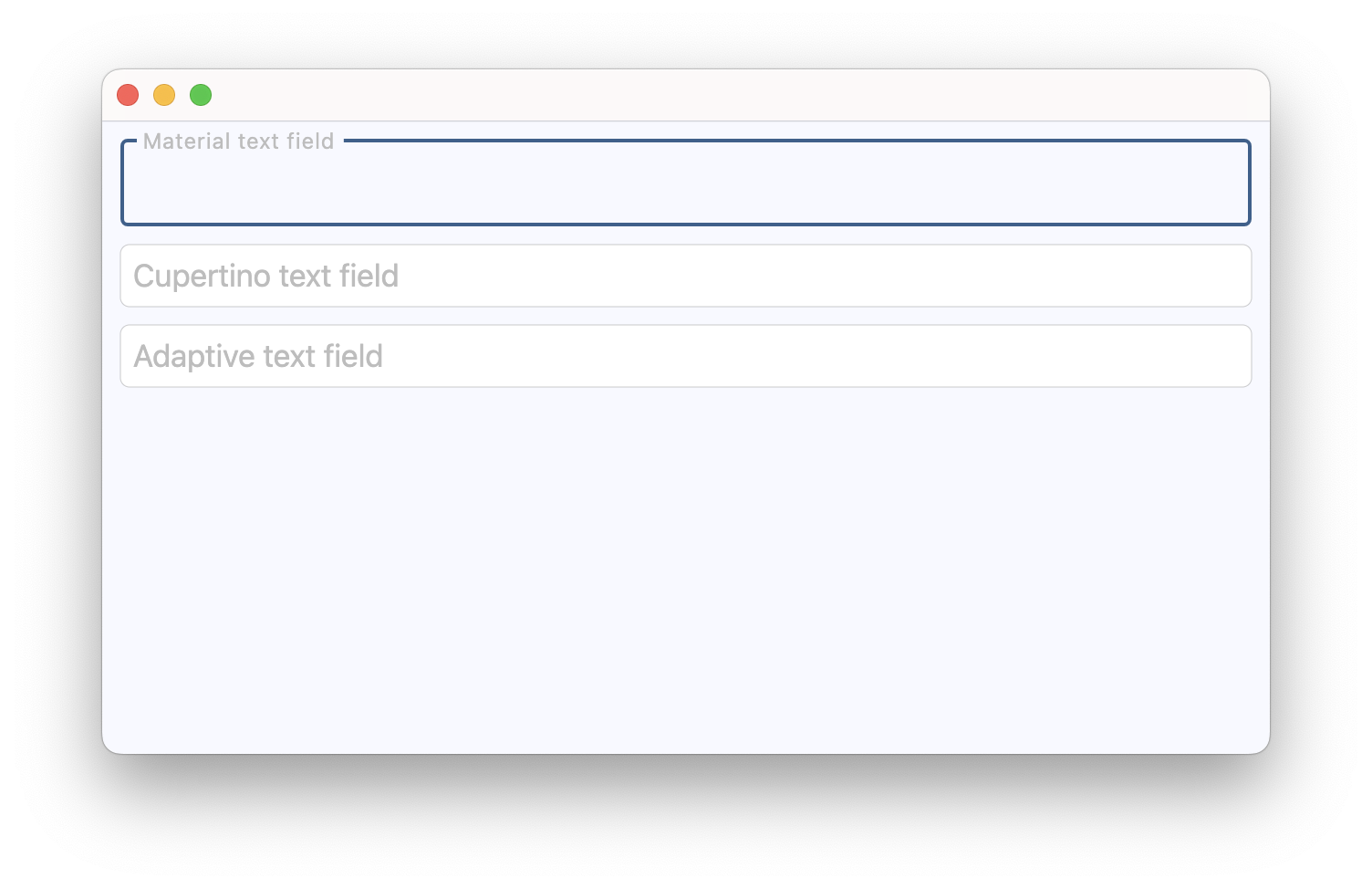
ft.CupertinoTextField(placeholder_text="Search")

Inherits: TextField
Properties
blend_mode- The blend mode applied to theFormFieldControl.bgcolororgradientbackground.clear_button_semantics_label- The semantic label for the clear button used by screen readers.clear_button_visibility_mode- Defines the visibility of the clear button based on the state of text entry.gradient- Configures the gradient background.image- An image to paint above theFormFieldControl.bgcolororgradientbackground.padding- The padding around the text entry area between theFormFieldControl.prefixandFormFieldControl.suffixor the clear button whenclear_button_visibility_modeis notOverlayVisibilityMode.NEVER.placeholder_style- TheTextStyleto use forplaceholder_text.placeholder_text- A lighter colored placeholder hint that appears on the first line of the text field when the text entry is empty.prefix_visibility_mode- Defines the visibility of theFormFieldControl.prefixcontrol based on the state of text entry.shadows- A list of shadows behind this text field.suffix_visibility_mode- Defines the visibility of theFormFieldControl.suffixcontrol based on the state of text entry.
Examples
Cupertino, material and adaptive
import flet as ft


def main(page: ft.Page):
    page.add(
        ft.SafeArea(
            content=ft.Column(
                controls=[
                    ft.TextField(
                        label="Material text field",
                        label_style=ft.TextStyle(color=ft.Colors.GREY_400),
                    ),
                    ft.CupertinoTextField(
                        placeholder_text="Cupertino text field",
                        placeholder_style=ft.TextStyle(color=ft.Colors.GREY_400),
                    ),
                    ft.TextField(
                        adaptive=True,
                        label="Adaptive text field",
                        label_style=ft.TextStyle(color=ft.Colors.GREY_400),
                    ),
                ],
            ),
        )
    )


if __name__ == "__main__":
    ft.run(main)
Selection change
import flet as ft


def main(page: ft.Page):
    page.title = "Text selection"

    selection = ft.Text("Select some text from the field.")
    selection_details = ft.Text()
    caret = ft.Text("Caret position: -")

    def handle_selection_change(e: ft.TextSelectionChangeEvent[ft.CupertinoTextField]):
        selection.value = (
            f"Selection: '{e.selected_text}'" if e.selected_text else "No selection."
        )
        selection_details.value = f"start={e.selection.start}, end={e.selection.end}"
        caret.value = f"Caret position: {e.selection.end}"

    field = ft.CupertinoTextField(
        value="Lorem ipsum dolor sit amet, consectetur adipiscing elit.",
        multiline=True,
        min_lines=3,
        autofocus=True,
        on_selection_change=handle_selection_change,
    )

    async def select_characters(_: ft.Event[ft.Button]):
        await field.focus()
        field.selection = ft.TextSelection(
            base_offset=0,
            extent_offset=len(field.value),
        )

    async def move_caret(_: ft.Event[ft.Button]):
        await field.focus()
        field.selection = ft.TextSelection(base_offset=0, extent_offset=0)

    page.add(
        ft.SafeArea(
            content=ft.Column(
                spacing=10,
                controls=[
                    field,
                    selection,
                    selection_details,
                    caret,
                    ft.Button(content="Select all text", on_click=select_characters),
                    ft.Button(content="Move caret to start", on_click=move_caret),
                ],
            ),
        )
    )


if __name__ == "__main__":
    ft.run(main)
Background image
import flet as ft


async def main(page: ft.Page):
    page.theme_mode = ft.ThemeMode.LIGHT

    page.add(
        ft.SafeArea(
            content=ft.CupertinoTextField(
                label="Textfield Label",
                label_style=ft.TextStyle(italic=True, weight=ft.FontWeight.BOLD),
                bgcolor=ft.Colors.BLUE_GREY,
                image=ft.DecorationImage(src="https://picsum.photos/1000/260"),
            ),
        )
    )


if __name__ == "__main__":
    ft.run(main)
Properties
blend_modeclass-attributeinstance-attribute
blend_mode: BlendMode | None = NoneThe blend mode applied to the FormFieldControl.bgcolor
or gradient background.
clear_button_semantics_labelclass-attributeinstance-attribute
clear_button_semantics_label: str | None = 'Clear'The semantic label for the clear button used by screen readers.
This will be used by screen reading software to identify the clear button widget.
clear_button_visibility_modeclass-attributeinstance-attribute
clear_button_visibility_mode: OverlayVisibilityMode = (
    OverlayVisibilityMode.NEVER
)
Defines the visibility of the clear button based on the state of text entry.
Will appear only if no FormFieldControl.suffix is provided.
gradientclass-attributeinstance-attribute
gradient: Gradient | None = NoneConfigures the gradient background.
imageclass-attributeinstance-attribute
image: DecorationImage | None = NoneAn image to paint above the FormFieldControl.bgcolor
or gradient background.
paddingclass-attributeinstance-attribute
padding: PaddingValue = field(
    default_factory=lambda: Padding.all(7)
)
The padding around the text entry area between the FormFieldControl.prefix
and FormFieldControl.suffix
or the clear button when clear_button_visibility_mode
is not OverlayVisibilityMode.NEVER.
placeholder_styleclass-attributeinstance-attribute
placeholder_style: TextStyle | None = NoneThe TextStyle to use for placeholder_text.
placeholder_textclass-attributeinstance-attribute
placeholder_text: str | None = NoneA lighter colored placeholder hint that appears on the first line of the text field when the text entry is empty.
Defaults to an empty string.
prefix_visibility_modeclass-attributeinstance-attribute
prefix_visibility_mode: OverlayVisibilityMode = (
    OverlayVisibilityMode.ALWAYS
)
Defines the visibility of the FormFieldControl.prefix
control based on the state of text entry.
Has no effect if
FormFieldControl.prefix
is not specified.
shadowsclass-attributeinstance-attribute
shadows: BoxShadowValue | None = NoneA list of shadows behind this text field.
suffix_visibility_modeclass-attributeinstance-attribute
suffix_visibility_mode: OverlayVisibilityMode = (
    OverlayVisibilityMode.ALWAYS
)
Defines the visibility of the FormFieldControl.suffix
control based on the state of text entry.
Has no effect if
FormFieldControl.suffix
is not specified.