Chip
Chips are compact elements that represent an attribute, text, entity, or action.
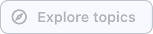
Example:
ft.Chip(
    label="Explore topics",
    leading=ft.Icon(ft.Icons.EXPLORE_OUTLINED),
)
Inherits: LayoutControl
Properties
autofocus- Whether this chip will be selected as the initial focus.bgcolor- Color to be used for the unselected, enabled chip's background.border_side- Defines the color and weight of this chip's outline.check_color- The color of this chip's check mark when a check mark is visible.clip_behavior- The content will be clipped (or not) according to this option.color- The color that fills this chip in variousControlState.delete_drawer_animation_style- The animation style for thedelete_icon's animations.delete_icon- AControlto display to the right of this chip'slabelin caseon_deleteevent is specified.delete_icon_color- The color of thedelete_icon.delete_icon_size_constraints- The size constraints for thedelete_iconcontrol.delete_icon_tooltip- The text to be used for this chip'sdelete_icontooltip.disabled_color- The color used for this chip's background if it is disabled.elevation- A non-negative value which defines the size of the shadow below this chip.elevation_on_click- The elevation to be applied on this chip relative to its parent during the press motion.enable_animation_style- The animation style for the enable and disable animations.label- The primary content of this chip.label_padding- The padding around thelabel.label_text_style- The style to be applied to this chip'slabel.leading- AControlto display to the left of this chip'slabel.leading_drawer_animation_style- The animation style for theleadingcontrol's animations.leading_size_constraints- The size constraints for theleadingcontrol.padding- The padding between thelabeland the outside shape.select_animation_style- The animation style for the select and unselect animations.selected- Ifon_selectevent is specified,selectedproperty is used to determine whether this chip is selected or not.selected_color- The color used for this chip's background when it is selected.selected_shadow_color- The color used for this chip's background when the elevation is greater than0and this chip is selected.shadow_color- The color used for this chip's background when the elevation is greater than0and this chip is not selected.shape- The shape of the border around this chip.show_checkmark- Ifon_selectevent is specified and chip is selected,show_checkmarkis used to determine whether or not to show a checkmark.visual_density- TBD
Events
Examples
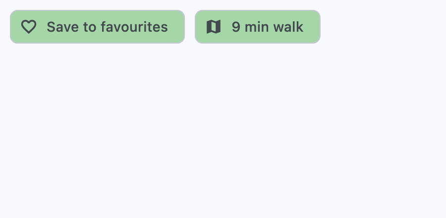
Assist chips
Assist chips are chips with leading icon and on_click event specified.
They represent smart or automated actions that appear dynamically and contextually in a UI.
An alternative to assist chips are buttons, which should appear persistently and consistently.
import flet as ft


def main(page: ft.Page):
    url_launcher = ft.UrlLauncher()
    page.services.append(url_launcher)

    def handle_chip1_click(e: ft.Event[ft.Chip]):
        e.control.label.value = "Saved to favorites"
        e.control.leading = ft.Icon(ft.Icons.FAVORITE_OUTLINED)
        e.control.disabled = True

    async def handle_chip2_click(e: ft.Event[ft.Chip]):
        await url_launcher.launch_url("https://maps.google.com")

    page.add(
        ft.SafeArea(
            content=ft.Row(
                controls=[
                    ft.Chip(
                        label=ft.Text("Save to favourites"),
                        leading=ft.Icon(ft.Icons.FAVORITE_BORDER_OUTLINED),
                        bgcolor=ft.Colors.GREEN_200,
                        disabled_color=ft.Colors.GREEN_100,
                        autofocus=True,
                        on_click=handle_chip1_click,
                    ),
                    ft.Chip(
                        label=ft.Text("9 min walk"),
                        leading=ft.Icon(ft.Icons.MAP_SHARP),
                        bgcolor=ft.Colors.GREEN_200,
                        on_click=handle_chip2_click,
                    ),
                ]
            )
        )
    )


if __name__ == "__main__":
    ft.run(main)
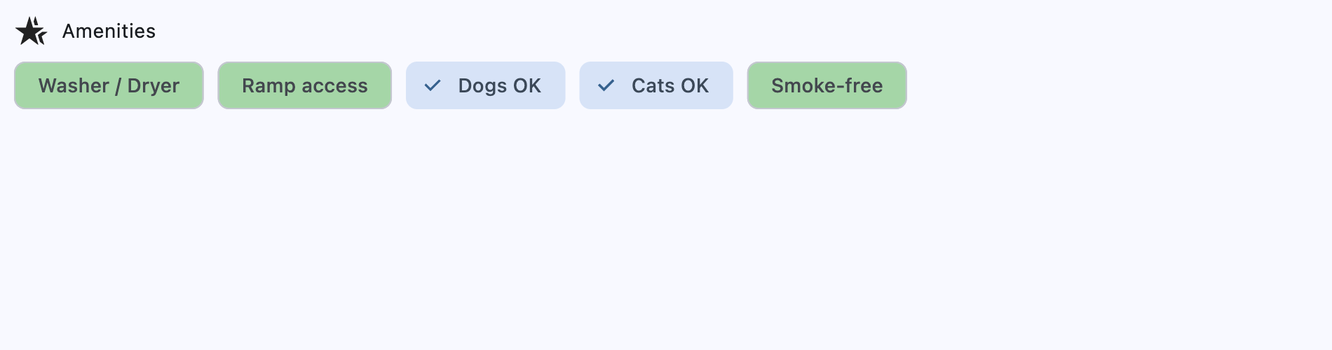
Filter chips
Filter chips are chips with on_select event specified.
They use tags or descriptive words provided in the label to filter content. They can be a good alternative to switches or checkboxes.
import flet as ft


def main(page: ft.Page):
    def handle_amenity_selection(e: ft.Event[ft.Chip]):
        print("Amenity selected:", e.control.label.value)

    amenities = ["Washer / Dryer", "Ramp access", "Dogs OK", "Cats OK", "Smoke-free"]

    page.add(
        ft.SafeArea(
            content=ft.Column(
                controls=[
                    ft.Row(
                        controls=[
                            ft.Icon(ft.Icons.HOTEL_CLASS),
                            ft.Text("Amenities"),
                        ]
                    ),
                    ft.Row(
                        controls=[
                            ft.Chip(
                                label=ft.Text(amenity),
                                bgcolor=ft.Colors.GREEN_200,
                                disabled_color=ft.Colors.GREEN_100,
                                autofocus=True,
                                on_select=handle_amenity_selection,
                            )
                            for amenity in amenities
                        ]
                    ),
                ]
            )
        )
    )


if __name__ == "__main__":
    ft.run(main)
Properties
autofocusclass-attributeinstance-attribute
autofocus: bool = FalseWhether this chip will be selected as the initial focus.
If there is more than one control on a page with autofocus set, then the first one added to the page will get focus.
bgcolorclass-attributeinstance-attribute
bgcolor: ColorValue | None = NoneColor to be used for the unselected, enabled chip's background.
border_sideclass-attributeinstance-attribute
border_side: BorderSide | None = NoneDefines the color and weight of this chip's outline.
check_colorclass-attributeinstance-attribute
check_color: ColorValue | None = NoneThe color of this chip's check mark when a check mark is visible.
clip_behaviorclass-attributeinstance-attribute
clip_behavior: ClipBehavior = ClipBehavior.NONEThe content will be clipped (or not) according to this option.
colorclass-attributeinstance-attribute
color: ControlStateValue[ColorValue] | None = NoneThe color that fills this chip in various ControlState.
delete_drawer_animation_styleclass-attributeinstance-attribute
delete_drawer_animation_style: AnimationStyle | None = NoneThe animation style for the delete_icon's animations.
delete_iconclass-attributeinstance-attribute
delete_icon: Control | None = NoneA Control to display to the right of this chip's label
in case on_delete event is specified.
delete_icon_colorclass-attributeinstance-attribute
delete_icon_color: ColorValue | None = NoneThe color of the delete_icon.
delete_icon_size_constraintsclass-attributeinstance-attribute
delete_icon_size_constraints: BoxConstraints | None = NoneThe size constraints for the delete_icon control.
If None, it defaults to a minimum size of chip height or label height
(whichever is greater) and a padding of 8.0 pixels on all sides.
delete_icon_tooltipclass-attributeinstance-attribute
delete_icon_tooltip: str | None = NoneThe text to be used for this chip's delete_icon tooltip. If not provided or provided with an empty string, the tooltip of the delete icon will not be displayed.
disabled_colorclass-attributeinstance-attribute
disabled_color: ColorValue | None = NoneThe color used for this chip's background if it is disabled.
elevationclass-attributeinstance-attribute
elevation: Number | None = NoneA non-negative value which defines the size of the shadow below this chip.
Defaults to 0.
Raises:
- ValueError - If
elevationis negative.
elevation_on_clickclass-attributeinstance-attribute
elevation_on_click: Number | None = NoneThe elevation to be applied on this chip relative to its parent during the press motion. This controls the size of the shadow below this chip.
Defaults to 8.0.
Raises:
- ValueError - If it is not greater than or equal to
0.0.
enable_animation_styleclass-attributeinstance-attribute
enable_animation_style: AnimationStyle | None = NoneThe animation style for the enable and disable animations.
labelinstance-attribute
label: StrOrControlThe primary content of this chip.
Typically a Text control.
label_paddingclass-attributeinstance-attribute
label_padding: PaddingValue | None = NoneThe padding around the label.
By default, this is 4 logical pixels at the beginning and the end of
the label, and zero on top and bottom.
label_text_styleclass-attributeinstance-attribute
label_text_style: TextStyle | None = NoneThe style to be applied to this chip's label.
leadingclass-attributeinstance-attribute
leading: Control | None = NoneA Control to display to the left of this chip's label.
Typically the leading control is an Icon or a CircleAvatar.
leading_drawer_animation_styleclass-attributeinstance-attribute
leading_drawer_animation_style: AnimationStyle | None = NoneThe animation style for the leading control's animations.
leading_size_constraintsclass-attributeinstance-attribute
leading_size_constraints: BoxConstraints | None = NoneThe size constraints for the leading control.
If None, it defaults to a minimum size of chip height or label height
(whichever is greater) and a padding of 8.0 pixels on all sides.
paddingclass-attributeinstance-attribute
padding: PaddingValue | None = NoneThe padding between the label and the outside shape.
Defaults to 8 logical pixels on all sides.
select_animation_styleclass-attributeinstance-attribute
select_animation_style: AnimationStyle | None = NoneThe animation style for the select and unselect animations.
selectedclass-attributeinstance-attribute
selected: bool = FalseIf on_select event is specified, selected property is used to determine whether this chip is selected or not.
selected_colorclass-attributeinstance-attribute
selected_color: ColorValue | None = NoneThe color used for this chip's background when it is selected.
selected_shadow_colorclass-attributeinstance-attribute
selected_shadow_color: ColorValue | None = NoneThe color used for this chip's background when the elevation is greater than 0 and this chip is selected.
shadow_colorclass-attributeinstance-attribute
shadow_color: ColorValue | None = NoneThe color used for this chip's background when the elevation is greater than 0 and this chip is not selected.
shapeclass-attributeinstance-attribute
shape: OutlinedBorder | None = NoneThe shape of the border around this chip.
Defaults to ChipTheme.shape, or if that is resolves to
None, falls back to RoundedRectangleBorder(radius=8).
Events
on_blurclass-attributeinstance-attribute
on_blur: ControlEventHandler[Chip] | None = NoneCalled when this chip has lost focus.
on_clickclass-attributeinstance-attribute
on_click: ControlEventHandler[Chip] | None = NoneCalled when the user clicks on this chip.
Raises:
- ValueError - If specified together with
on_select.
on_deleteclass-attributeinstance-attribute
on_delete: ControlEventHandler[Chip] | None = NoneCalled when the user clicks on the delete_icon.
on_focusclass-attributeinstance-attribute
on_focus: ControlEventHandler[Chip] | None = NoneCalled when this chip has received focus.
on_selectclass-attributeinstance-attribute
on_select: ControlEventHandler[Chip] | None = NoneCalled when the user clicks on this chip.
It internally changes selected property to the opposite value.
Raises:
- ValueError - If specified together with
on_click.