Radio
Radio buttons let people select a single option from two or more choices.
Example:
ft.RadioGroup(
    content=ft.Row(
        controls=[ft.Radio(label=f"{i}") for i in range(1, 4)],
        alignment=ft.MainAxisAlignment.CENTER,
    )
)

Inherits: LayoutControl, AdaptiveControl
Properties
active_color- The color used to fill this radio when it is selected.autofocus- True if the control will be selected as the initial focus.fill_color- The color that fills the radio, in all or specificControlStatestates.focus_color- The color of this radio when it has the input focus.hover_color- The color of this radio when it is hovered.label- The clickable label to display on the right of a Radio.label_position- Defaults toLabelPosition.RIGHT.label_style- The label's style.mouse_cursor- The cursor for a mouse pointer entering or hovering over this control.overlay_color- The overlay color of this radio in all or specificControlStatestates.splash_radius- The splash radius of the circular Material ink response.toggleable- Set toTrueif this radio button is allowed to be returned to an indeterminate state by selecting it again when selected.value- The value to set to containingRadioGroupwhen the radio is selected.visual_density- Defines how compact the radio's layout will be.
Events
Examples
Radio
import flet as ft
def main(page: ft.Page):
def handle_button_click(e: ft.Event[ft.Button]):
message.value = f"Your favorite color is: {group.value}"
page.add(
ft.SafeArea(
content=ft.Column(
controls=[
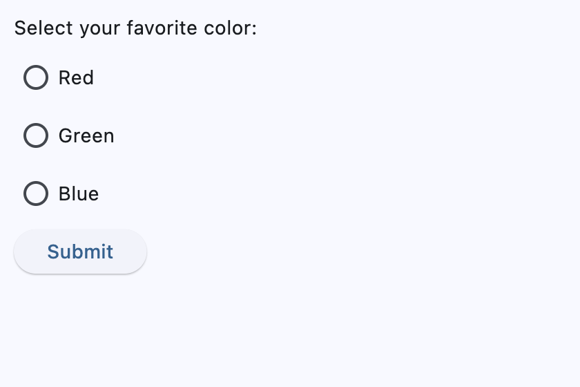
ft.Text("Select your favorite color:"),
group := ft.RadioGroup(
content=ft.Column(
controls=[
ft.Radio(
key="basic_radio_red", value="red", label="Red"
),
ft.Radio(value="green", label="Green"),
ft.Radio(value="blue", label="Blue"),
]
)
),
ft.Button(
key="basic_submit_button",
content="Submit",
on_click=handle_button_click,
),
message := ft.Text(),
]
)
)
)
if __name__ == "__main__":
ft.run(main)
Handling Selection Changes
import flet as ft
def main(page: ft.Page):
def handle_selection_change(e: ft.Event[ft.RadioGroup]):
message.value = f"Your favorite color is: {e.control.value}"
page.add(
ft.SafeArea(
content=ft.Column(
controls=[
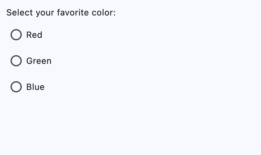
ft.Text("Select your favorite color:"),
ft.RadioGroup(
on_change=handle_selection_change,
content=ft.Column(
controls=[
ft.Radio(value="red", label="Red"),
ft.Radio(value="green", label="Green"),
ft.Radio(value="blue", label="Blue"),
]
),
),
message := ft.Text(),
]
)
)
)
if __name__ == "__main__":
ft.run(main)
Styled
import flet as ft
def main(page: ft.Page):
page.add(
ft.SafeArea(
content=ft.RadioGroup(
ft.Column(
controls=[
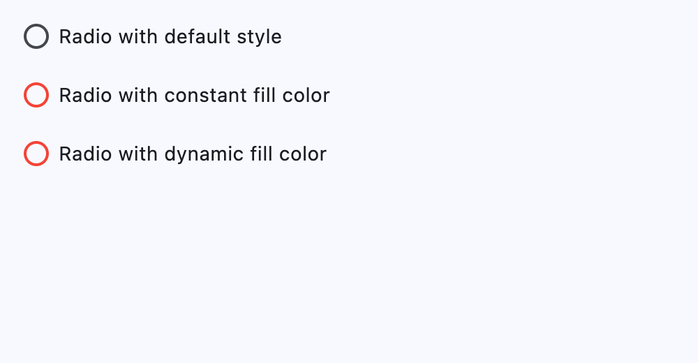
ft.Radio(
key="styled_radio_default",
label="Radio with default style",
value="1",
),
ft.Radio(
key="styled_radio_constant",
label="Radio with constant fill color",
value="2",
fill_color=ft.Colors.RED,
),
ft.Radio(
key="styled_radio_dynamic",
label="Radio with dynamic fill color",
value="3",
fill_color={
ft.ControlState.HOVERED: ft.Colors.BLUE,
ft.ControlState.SELECTED: ft.Colors.GREEN,
ft.ControlState.DEFAULT: ft.Colors.RED,
},
),
]
)
)
)
)
if __name__ == "__main__":
ft.run(main)
Properties
active_colorclass-attributeinstance-attribute
active_color: ColorValue | None = NoneThe color used to fill this radio when it is selected.
autofocusclass-attributeinstance-attribute
autofocus: bool = FalseTrue if the control will be selected as the initial focus.
If there is more than one control on a page with autofocus set, then the first one added to the page will get focus.
fill_colorclass-attributeinstance-attribute
fill_color: ControlStateValue[ColorValue] | None = NoneThe color that fills the radio, in all or specific ControlState states.
focus_colorclass-attributeinstance-attribute
focus_color: ColorValue | None = NoneThe color of this radio when it has the input focus.
hover_colorclass-attributeinstance-attribute
hover_color: ColorValue | None = NoneThe color of this radio when it is hovered.
labelclass-attributeinstance-attribute
label: str = ''The clickable label to display on the right of a Radio.
label_positionclass-attributeinstance-attribute
label_position: LabelPosition = LabelPosition.RIGHTDefaults to LabelPosition.RIGHT.
mouse_cursorclass-attributeinstance-attribute
mouse_cursor: MouseCursor | None = NoneThe cursor for a mouse pointer entering or hovering over this control.
overlay_colorclass-attributeinstance-attribute
overlay_color: ControlStateValue[ColorValue] | None = NoneThe overlay color of this radio in all or specific ControlState states.
splash_radiusclass-attributeinstance-attribute
splash_radius: Number | None = NoneThe splash radius of the circular Material ink response.
toggleableclass-attributeinstance-attribute
toggleable: bool = FalseSet to True if this radio button is allowed to be returned to an indeterminate state by selecting it again when selected.
valueclass-attributeinstance-attribute
value: str | None = NoneThe value to set to containing RadioGroup when the radio is selected.
visual_densityclass-attributeinstance-attribute
visual_density: VisualDensity | None = NoneDefines how compact the radio's layout will be.
Events
on_blurclass-attributeinstance-attribute
on_blur: ControlEventHandler[Radio] | None = NoneCalled when the control has lost focus.
on_focusclass-attributeinstance-attribute
on_focus: ControlEventHandler[Radio] | None = NoneCalled when the control has received focus.