RangeSlider
A Material Design range slider. Used to select a range from a range of values.
A range slider can be used to select from either a continuous or a discrete
set of values. The default is to use a continuous range of values from
min to max.
Example:
ft.RangeSlider(
    min=0,
    max=10,
    start_value=2,
    divisions=10,
    end_value=7,
)

Inherits: LayoutControl
Properties
active_color- The color to use for the portion of the slider track that is active.divisions- The number of discrete divisions.end_value- The currently selected end value of this slider.inactive_color- The color for the inactive portions of the slider track.label- A label to show above the slider thumbs when the slider is active.max- The maximum value the user can select.min- The minimum value the user can select.mouse_cursor- The cursor for a mouse pointer entering or hovering over this control.overlay_color- The highlight color that's typically used to indicate that the range slider thumb is inControlState.HOVEREDorControlState.DRAGGEDstate.round- The number of decimals displayed on thelabelcontaining{value}.start_value- The currently selected start value for this slider.
Events
on_change- Called when the state of this slider is changed.on_change_end- Called when the user is done selecting a new value for this slider.on_change_start- Called when the user starts selecting a new value for this slider.
Examples
RangeSlider
import flet as ft
def main(page: ft.Page):
page.add(
ft.SafeArea(
content=ft.Column(
controls=[
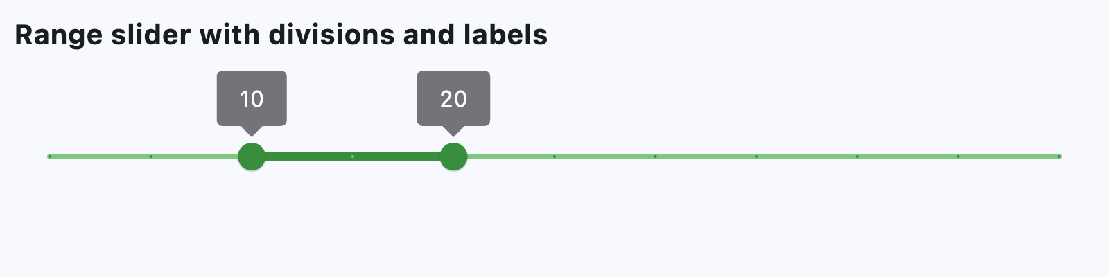
ft.Text(
value="Range slider with divisions and labels",
size=20,
weight=ft.FontWeight.BOLD,
),
ft.Container(height=30),
ft.RangeSlider(
min=0,
max=50,
start_value=10,
divisions=10,
end_value=20,
inactive_color=ft.Colors.GREEN_300,
active_color=ft.Colors.GREEN_700,
overlay_color=ft.Colors.GREEN_100,
label="{value}",
),
]
),
)
)
if __name__ == "__main__":
ft.run(main)
Handling Change Events
import flet as ft


def main(page: ft.Page):
    page.scroll = ft.ScrollMode.AUTO

    def handle_slider_change_start(e: ft.Event[ft.RangeSlider]):
        print(f"on_change_start: {e.control.start_value}, {e.control.end_value}")

    def handle_slider_change(e: ft.Event[ft.RangeSlider]):
        print(f"on_change: {e.control.start_value}, {e.control.end_value}")

    def handle_slider_change_end(e: ft.Event[ft.RangeSlider]):
        print(f"on_change_end: {e.control.start_value}, {e.control.end_value}")
        message.value = f"on_change_end: {e.control.start_value}, {e.control.end_value}"

    page.add(
        ft.SafeArea(
            content=ft.Column(
                controls=[
                    ft.Text(
                        value="Range slider with events",
                        size=20,
                        weight=ft.FontWeight.BOLD,
                    ),
                    ft.Container(height=30),
                    ft.RangeSlider(
                        divisions=100,
                        min=0,
                        max=100,
                        start_value=10,
                        end_value=20,
                        on_change_start=handle_slider_change_start,
                        on_change=handle_slider_change,
                        on_change_end=handle_slider_change_end,
                        label="{value}%",
                    ),
                    message := ft.Text(),
                ]
            )
        )
    )


if __name__ == "__main__":
    ft.run(main)
Properties
active_colorclass-attributeinstance-attribute
active_color: ColorValue | None = NoneThe color to use for the portion of the slider track that is active.
The "active" segment of the range slider is the span between the thumbs.
divisionsclass-attributeinstance-attribute
divisions: int | None = NoneThe number of discrete divisions.
Typically used with label to show the current discrete values.
If not set, this slider is continuous and label is not displayed.
Raises:
- ValueError - If it is not strictly greater than
0.
end_valueinstance-attribute
end_value: NumberThe currently selected end value of this slider.
The right thumb of this slider is drawn at a position that corresponds
to this value. Use label to change the label displayed on the thumb.
Raises:
- ValueError - If it is not less than or equal to
max. - ValueError - If it is not greater than or equal to
start_value.
inactive_colorclass-attributeinstance-attribute
inactive_color: ColorValue | None = NoneThe color for the inactive portions of the slider track.
The "inactive" segments of the slider are the span of tracks between the min and the start thumb, and the end thumb and the max.
labelclass-attributeinstance-attribute
label: str | None = NoneA label to show above the slider thumbs when the slider is active.
It may contain {value} which will be replaced with realtime values of
start_value and end_value, in the corresponding slider thumbs.
If not set, then the labels will not be displayed.
If divisions is not set, this slider is
continuous and labels are not displayed.
maxclass-attributeinstance-attribute
max: Number = 1.0The maximum value the user can select.
If the max is equal to the min, then the slider is disabled.
minclass-attributeinstance-attribute
min: Number = 0.0The minimum value the user can select.
If the max is equal to the min, then the slider is disabled.
Raises:
- ValueError - If it is not less than or equal to
start_value. - ValueError - If it is not less than or equal to
max.
mouse_cursorclass-attributeinstance-attribute
mouse_cursor: ControlStateValue[MouseCursor] | None = NoneThe cursor for a mouse pointer entering or hovering over this control.
overlay_colorclass-attributeinstance-attribute
overlay_color: ControlStateValue[ColorValue] | None = NoneThe highlight color that's typically used to indicate that the range slider thumb is in ControlState.HOVERED or ControlState.DRAGGED state.
roundclass-attributeinstance-attribute
round: int = 0The number of decimals displayed on the label containing {value}.
Defaults to 0 - value rounded to the nearest integer.
Raises:
- ValueError - If it is not between
0and20, inclusive.
Events
on_changeclass-attributeinstance-attribute
on_change: ControlEventHandler[RangeSlider] | None = NoneCalled when the state of this slider is changed.
on_change_endclass-attributeinstance-attribute
on_change_end: ControlEventHandler[RangeSlider] | None = (
    None
)
Called when the user is done selecting a new value for this slider.
on_change_startclass-attributeinstance-attribute
on_change_start: ControlEventHandler[RangeSlider] | None = (
    None
)
Called when the user starts selecting a new value for this slider.