DateRangePicker
A Material-style date range picker dialog.
It can be opened by calling Page.show_dialog method.
Depending on the entry_mode, it will show either a Calendar
or an Input (text field) for picking a date range.
picker = ft.DateRangePicker()

ft.Button(
    "Pick date range",
    icon=ft.Icons.DATE_RANGE,
    on_click=lambda _: page.show_dialog(picker),
)
Inherits: DialogControl
Properties
barrier_color- The color of the modal barrier that darkens everything below the date picker.cancel_text- The text that is displayed on the cancel button.confirm_text- The text that is displayed on the confirm button.current_date- The date representing today.end_value- The selected end date that the picker should display.entry_mode- The initial mode of date entry method for the date picker dialog.error_format_text- The error message displayed below the TextField if the entered date is not in the correct format.error_invalid_range_text- The message used when the date range is invalid (e.g.error_invalid_text- The error message displayed below the TextField if the date is earlier thanfirst_dateor later thanlast_date.field_end_hint_text- The text used to prompt the user when no text has been entered in the end field.field_end_label_text- The label for the end date text input field.field_start_hint_text- The text used to prompt the user when no text has been entered in the start field.field_start_label_text- The label for the start date text input field.first_date- The earliest allowable date on the date range.help_text- The text that is displayed at the top of the header.keyboard_type- The type of keyboard to use for editing the text.last_date- The latest allowable date on the date range.locale- The locale for this date picker dialog.modal- Whether this date picker cannot be dismissed by clicking the area outside of it.save_text- The label on the save button for the fullscreen calendar mode.start_value- The selected start date that the picker should display.switch_to_calendar_icon- The name of the icon displayed in the corner of the dialog whenentry_modeisDatePickerEntryMode.INPUT.switch_to_input_icon- The name of the icon displayed in the corner of the dialog whenentry_modeisDatePickerEntryMode.CALENDAR.
Events
on_change- Called when user clicks confirm button.
Examples
DateRangePicker
import datetime
import flet as ft
def main(page: ft.Page):
page.horizontal_alignment = ft.CrossAxisAlignment.CENTER
messages = ft.Column(tight=True)
def handle_change(e: ft.Event[ft.DateRangePicker]):
messages.controls.extend(
[
ft.Text(
f"Start Date changed: {e.control.start_value.strftime('%m/%d/%Y')}"
),
ft.Text(
f"End Date changed: {e.control.end_value.strftime('%m/%d/%Y')}"
),
]
)
def handle_dismissal(_: ft.Event[ft.DialogControl]):
messages.controls.append(ft.Text("DateRangePicker dismissed"))
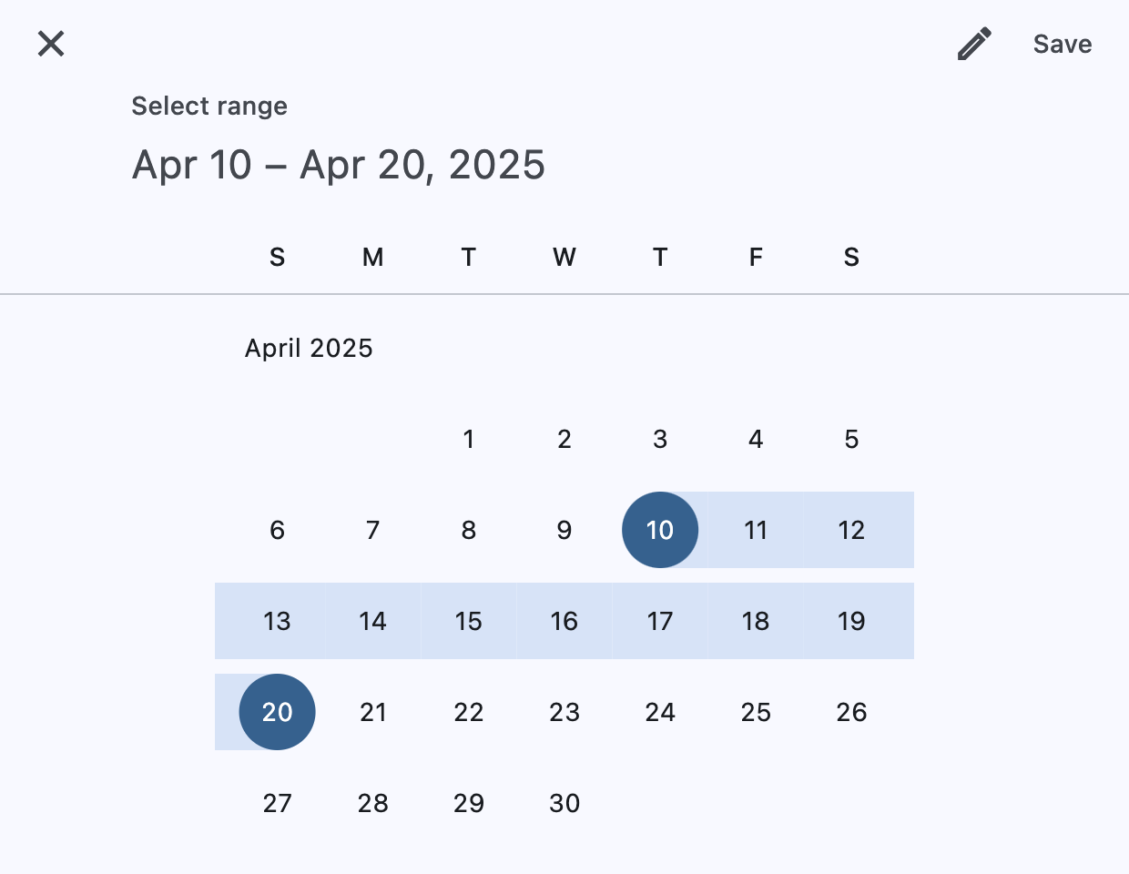
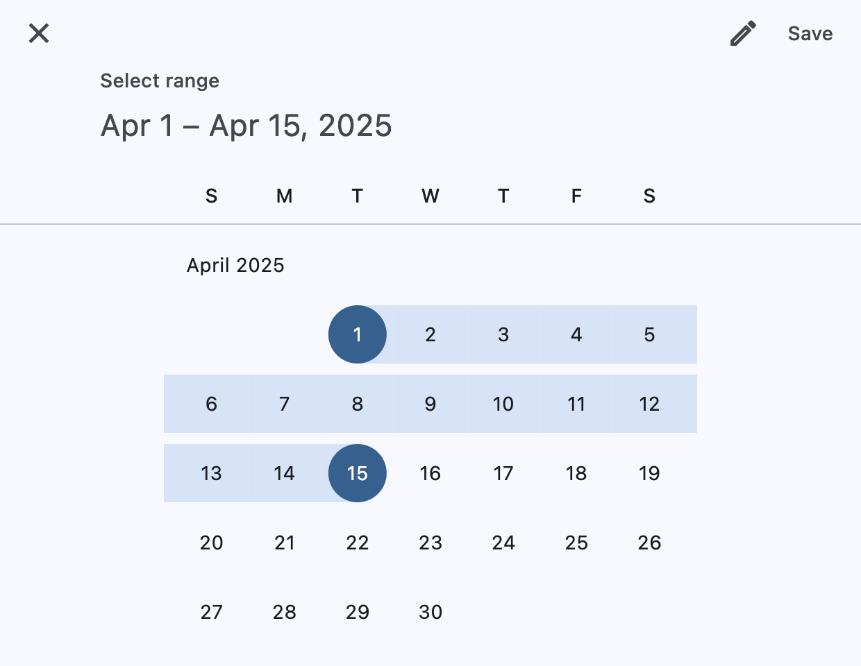
today = datetime.datetime(year=2025, month=4, day=15)
picker = ft.DateRangePicker(
start_value=datetime.datetime(year=today.year, month=today.month, day=1),
end_value=datetime.datetime(year=today.year, month=today.month, day=15),
first_date=datetime.datetime(year=2024, month=1, day=1),
last_date=datetime.datetime(year=2026, month=12, day=31),
current_date=today,
on_change=handle_change,
on_dismiss=handle_dismissal,
)
page.add(
ft.SafeArea(
content=ft.Column(
horizontal_alignment=ft.CrossAxisAlignment.CENTER,
controls=[
ft.Button(
icon=ft.Icons.DATE_RANGE,
on_click=lambda _: page.show_dialog(picker),
content="Pick date range",
),
messages,
],
),
)
)
if __name__ == "__main__":
ft.run(main)
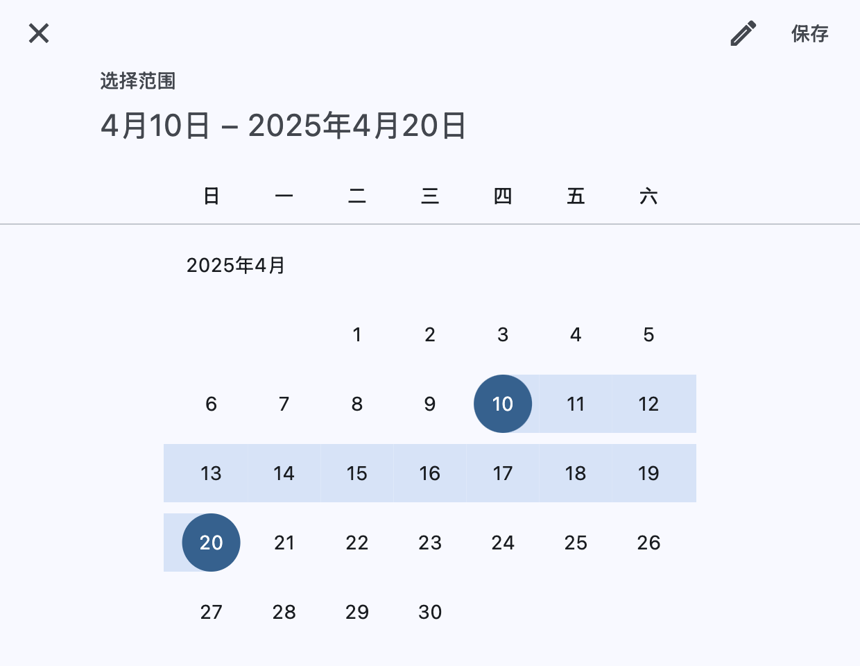
Custom locale
import datetime

import flet as ft


def main(page: ft.Page):
    page.horizontal_alignment = ft.CrossAxisAlignment.CENTER

    current_date = datetime.datetime(year=2025, month=4, day=15)

    page.add(
        ft.SafeArea(
            content=ft.Button(
                icon=ft.Icons.CALENDAR_MONTH,
                on_click=lambda _: page.show_dialog(
                    ft.DateRangePicker(
                        locale=ft.Locale("zh", "Hans"),
                        start_value=datetime.datetime(year=2025, month=4, day=10),
                        end_value=datetime.datetime(year=2025, month=4, day=20),
                        first_date=datetime.datetime(year=2024, month=1, day=1),
                        last_date=datetime.datetime(year=2026, month=12, day=31),
                        current_date=current_date,
                    )
                ),
                content="Pick dates (zh_Hans locale)",
            ),
        )
    )


if __name__ == "__main__":
    ft.run(main)
Properties
barrier_colorclass-attributeinstance-attribute
barrier_color: ColorValue | None = NoneThe color of the modal barrier that darkens everything below the date picker.
If None, the DialogTheme.barrier_color is used.
If it is also None, then Colors.BLACK_54 is used.
cancel_textclass-attributeinstance-attribute
cancel_text: str | None = NoneThe text that is displayed on the cancel button.
confirm_textclass-attributeinstance-attribute
confirm_text: str | None = NoneThe text that is displayed on the confirm button.
current_dateclass-attributeinstance-attribute
current_date: DateTimeValue = field(
    default_factory=lambda: datetime.now()
)
The date representing today. It will be highlighted in the day grid.
end_valueclass-attributeinstance-attribute
end_value: DateTimeValue | None = NoneThe selected end date that the picker should display.
Defaults to current_date.
entry_modeclass-attributeinstance-attribute
entry_mode: DatePickerEntryMode = (
    DatePickerEntryMode.CALENDAR
)
The initial mode of date entry method for the date picker dialog.
error_format_textclass-attributeinstance-attribute
error_format_text: str | None = NoneThe error message displayed below the TextField if the entered date is not in the correct format.
error_invalid_range_textclass-attributeinstance-attribute
error_invalid_range_text: str | None = NoneThe message used when the date range is invalid (e.g. start date is after end date).
error_invalid_textclass-attributeinstance-attribute
error_invalid_text: str | None = NoneThe error message displayed below the TextField if the date is earlier than first_date or later than last_date.
field_end_hint_textclass-attributeinstance-attribute
field_end_hint_text: str | None = NoneThe text used to prompt the user when no text has been entered in the end field.
field_end_label_textclass-attributeinstance-attribute
field_end_label_text: str | None = NoneThe label for the end date text input field.
field_start_hint_textclass-attributeinstance-attribute
field_start_hint_text: str | None = NoneThe text used to prompt the user when no text has been entered in the start field.
field_start_label_textclass-attributeinstance-attribute
field_start_label_text: str | None = NoneThe label for the start date text input field.
first_dateclass-attributeinstance-attribute
first_date: DateTimeValue = field(
    default_factory=lambda: datetime(
        year=1900, month=1, day=1
    )
)
The earliest allowable date on the date range.
help_textclass-attributeinstance-attribute
help_text: str | None = NoneThe text that is displayed at the top of the header.
This is used to indicate to the user what they are selecting a date for.
keyboard_typeclass-attributeinstance-attribute
keyboard_type: KeyboardType = KeyboardType.DATETIMEThe type of keyboard to use for editing the text.
last_dateclass-attributeinstance-attribute
last_date: DateTimeValue = field(
    default_factory=lambda: datetime(
        year=2050, month=1, day=1
    )
)
The latest allowable date on the date range.
localeclass-attributeinstance-attribute
locale: Locale | None = NoneThe locale for this date picker dialog. It is intended for (rare) cases where this dialog should be localized differently from the rest of the page.
It overrides the locale used by the page (see Page.locale_configuration),
but does not participate in page-level locale resolution.
If set to None (the default) or an inexistent/unsupported locale,
the current_locale of the
Page.locale_configuration is used as fallback.
modalclass-attributeinstance-attribute
modal: bool = FalseWhether this date picker cannot be dismissed by clicking the area outside of it.
save_textclass-attributeinstance-attribute
save_text: str | None = NoneThe label on the save button for the fullscreen calendar mode.
start_valueclass-attributeinstance-attribute
start_value: DateTimeValue | None = NoneThe selected start date that the picker should display.
Defaults to current_date.
switch_to_calendar_iconclass-attributeinstance-attribute
switch_to_calendar_icon: IconData | None = NoneThe name of the icon displayed in the corner of the dialog when entry_mode is DatePickerEntryMode.INPUT.
Clicking on this icon changes the entry_mode to
DatePickerEntryMode.CALENDAR.
If None, Icons.CALENDAR_TODAY is used.
switch_to_input_iconclass-attributeinstance-attribute
switch_to_input_icon: IconData | None = NoneThe name of the icon displayed in the corner of the dialog when entry_mode is DatePickerEntryMode.CALENDAR.
Clicking on this icon changes the entry_mode to
DatePickerEntryMode.INPUT.
If None, Icons.EDIT_OUTLINED is used.
Events
on_changeclass-attributeinstance-attribute
on_change: ControlEventHandler[DateRangePicker] | None = (
    None
)
Called when user clicks confirm button.
start_value and end_value are updated with selected dates.
The data property of the event handler
argument contains the selected dates.