Banner
A banner displays an important, succinct message, and provides actions for users to address (or dismiss the banner). A user action is required for it to be dismissed.
Banners are displayed at the top of the screen, below a top app bar. They are persistent and non-modal, allowing the user to either ignore them or interact with them at any time.
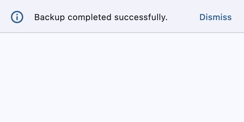
Example:
banner = ft.Banner(
    leading=ft.Icon(ft.Icons.INFO_OUTLINED, color=ft.Colors.PRIMARY),
    content=ft.Text("Backup completed successfully."),
    actions=[ft.TextButton("Dismiss")],
    bgcolor=ft.Colors.SURFACE_CONTAINER_LOW,
    open=True,
)
page.show_dialog(banner)
Inherits: DialogControl
Properties
actions- The set of actions that are displayed at the bottom or trailing side of this banner.bgcolor- The color of the surface of this banner.content- The content of this banner.content_padding- The amount of space by which to inset thecontent.content_text_style- The style to be used for theTextcontrols in thecontent.divider_color- The color of the divider.elevation- The elevation of this banner.force_actions_below- An override to force theactionsto be below thecontentregardless of how many there are.leading- The leading Control of this banner.leading_padding- The amount of space by which to inset theleadingcontrol.margin- The amount of space surrounding this banner.min_action_bar_height- The minimum action bar height.shadow_color- The color of the shadow below this banner.
Events
on_visible- Called when this banner is shown or made visible for the first time.
Examples
Banner
import flet as ft
def main(page: ft.Page):
page.horizontal_alignment = ft.CrossAxisAlignment.CENTER
def handle_banner_close(e: ft.Event[ft.TextButton]):
page.pop_dialog()
page.add(ft.Text("Action clicked: " + e.control.data))
action_button_style = ft.ButtonStyle(color=ft.Colors.BLUE)
banner = ft.Banner(
bgcolor=ft.Colors.AMBER_100,
leading=ft.Icon(ft.Icons.WARNING_AMBER_ROUNDED, color=ft.Colors.AMBER, size=40),
content=ft.Text(
value="Oops, there were some errors while trying to delete the file. "
"What would you like to do?",
color=ft.Colors.BLACK,
),
actions=[
ft.TextButton(
content="Retry",
style=action_button_style,
on_click=handle_banner_close,
data="retry",
),
ft.TextButton(
content="Ignore",
style=action_button_style,
on_click=handle_banner_close,
data="ignore",
),
ft.TextButton(
content="Cancel",
style=action_button_style,
on_click=handle_banner_close,
data="cancel",
),
],
)
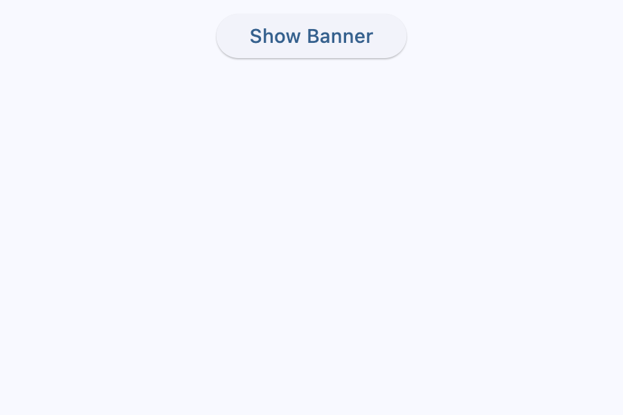
page.add(
ft.SafeArea(
content=ft.Column(
controls=[
ft.Button(
"Show Banner", on_click=lambda e: page.show_dialog(banner)
)
]
)
)
)
if __name__ == "__main__":
ft.run(main)
Properties
actionsinstance-attribute
actions: list[Control]The set of actions that are displayed at the bottom or trailing side of this banner.
Typically this is a list of TextButton
controls.
Raises:
- ValueError - If it does not contain at least one visible
Control.
bgcolorclass-attributeinstance-attribute
bgcolor: ColorValue | None = NoneThe color of the surface of this banner.
contentinstance-attribute
content: StrOrControlThe content of this banner.
Typically a Text control.
Raises:
- ValueError - If
contentis not visible.
content_paddingclass-attributeinstance-attribute
content_padding: PaddingValue | None = NoneThe amount of space by which to inset the content.
If the actions are below the content, this defaults to
Padding.only(left=16.0, top=24.0, right=16.0, bottom=4.0).
If the actions are trailing the content, this defaults to
Padding.only(left=16.0, top=2.0).
divider_colorclass-attributeinstance-attribute
divider_color: ColorValue | None = NoneThe color of the divider.
elevationclass-attributeinstance-attribute
elevation: Number | None = NoneThe elevation of this banner.
Raises:
- ValueError - If it is not greater than or equal to
0.
force_actions_belowclass-attributeinstance-attribute
force_actions_below: bool = FalseAn override to force the actions to be below the content regardless of how many there are.
If this is True, the actions will be placed below the content.
If this is False, the actions will be placed on the trailing side
of the content if actions length is 1 and below the content
if greater than 1.
leadingclass-attributeinstance-attribute
leading: IconDataOrControl | None = NoneThe leading Control of this banner.
Typically an Icon control.
leading_paddingclass-attributeinstance-attribute
leading_padding: PaddingValue | None = NoneThe amount of space by which to inset the leading control.
Defaults to BannerTheme.leading_padding,
or if that is None, falls back to Padding.only(end=16).
marginclass-attributeinstance-attribute
margin: MarginValue | None = NoneThe amount of space surrounding this banner.
min_action_bar_heightclass-attributeinstance-attribute
min_action_bar_height: Number = 52.0The minimum action bar height.
shadow_colorclass-attributeinstance-attribute
shadow_color: ColorValue | None = NoneThe color of the shadow below this banner.
Events
on_visibleclass-attributeinstance-attribute
on_visible: ControlEventHandler[Banner] | None = NoneCalled when this banner is shown or made visible for the first time.