Creating an Extension
While Flet controls leverage many built-in Flutter widgets to enable the creation of complex applications, not all Flutter widgets or third-party packages can be directly supported by the Flet team or included in the core Flet framework. At the same time, the Flutter ecosystem is vast and offers developers a wide range of possibilities to extend functionality beyond the core.
To address this, the Flet framework provides an extensibility mechanism. This allows you to incorporate widgets and APIs from your own custom Flutter packages or third-party libraries directly into your Flet application.
In this guide, you will learn how to create Flet extension from template and then customize it to integrate 3rd-party Flutter package into your Flet app.
Prerequisites
To integrate custom Flutter package into Flet you need to have basic understanding of how to create Flutter apps and packages in Dart language and have Flutter development environment configured. See Flutter Getting Started for more information about Flutter and Dart.
Create Flet extension from template
Flet now makes it easy to create and build projects with your custom controls based on Flutter widgets or Flutter 3rd-party packages. In the example below, we will be creating a custom Flet extension based on the flutter_spinkit package.
Step 1. Create new virtual environment and install Flet there.
Step 2. Create new extension project from template.
flet create --template extension --project-name flet-spinkit
A project with new FletSpinkit control will be created. The control is just a Flutter Text widget with text property, which we will customize later.
Step 3. Build example app.
Flet project created from extension template has examples/flet_spinkit_example folder with the example app.
When in the folder where your pyproject.toml for the app is (examples/flet_spinkit_example), run flet build command, for example, for macos:
flet build macos -v
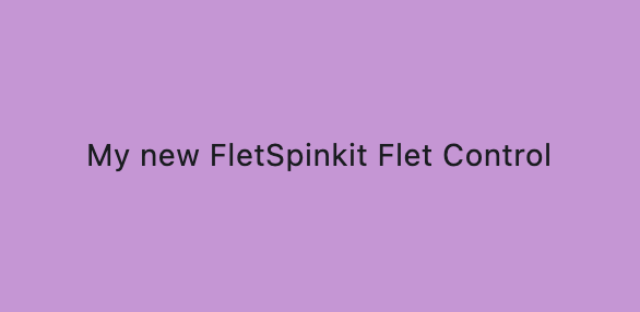
Open the app and see the new custom Flet Control:
open build/macos/flet-spinkit-example.app
Change Python files
Once the project was built for desktop once, you can make changes to your python files and run it without rebuilding.
First, if you are not using uv, install dependencies from pyproject.toml:
pip install .
or
poetry install
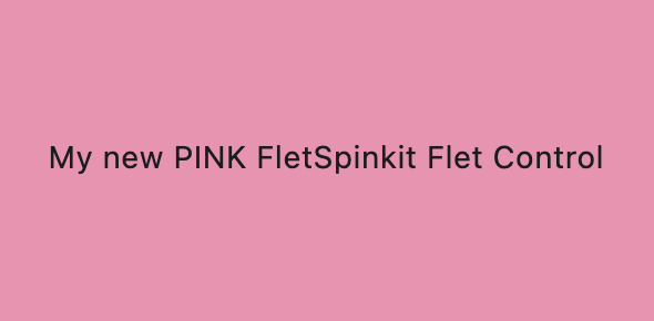
Now you can make changes to your example app main.py:
import flet as ft

from flet_spinkit import FletSpinkit

def main(page: ft.Page):
    page.vertical_alignment = ft.MainAxisAlignment.CENTER
    page.horizontal_alignment = ft.CrossAxisAlignment.CENTER

    page.add(
        ft.Container(
            height=150,
            width=300,
            alignment=ft.Alignment.CENTER,
            bgcolor=ft.Colors.PINK_200,
            content=FletSpinkit(
                tooltip="My new PINK FletSpinkit Control tooltip",
                value="My new PINK FletSpinkit Flet Control",
            ),
        ),
    )

ft.run(main)
and run:
flet run
Change Flutter package
When you make any changes to your flutter package, you need to rebuild:
flet build macos -v
If you need to debug, run this command:
build/macos/flet-spinkit-example.app/Contents/MacOS/flet-spinkit-example --debug
Integrate 3rd-party Flutter package
Let's integrate flutter_spinkit package into our Flet app.
Step 1. Add dependency
Go to src/flutter/flet_spinkit folder and run this command to add dependency to flutter_spinkit to pubspec.yaml:
flutter pub add flutter_spinkit
Read more information about using Flutter packages here.
Step 2. Modify dart file
In the src/flutter/flet_spinkit/lib/src/flet_spinkit.dart file, add import statement and replace Text widget with SpinKitRotatingCircle widget:
import 'package:flet/flet.dart';
import 'package:flutter/material.dart';
import 'package:flutter_spinkit/flutter_spinkit.dart';

class FletSpinkitControl extends StatelessWidget {
  final Control control;

  const FletSpinkitControl({
    super.key,
    required this.control,
  });

  @override
  Widget build(BuildContext context) {
    Widget myControl = SpinKitRotatingCircle(color: Colors.red, size: 100.0);

    return LayoutControl(control: control, child: myControl);
  }
}
Step 3. Rebuild example app
Go to examples/flet_spinkit_example, clear cache and rebuild your app:
flet build macos -v
Step 4. Run your app

Flet extension structure
After creating new Flet project from extension template, you will see the following folder structure:
├── LICENSE
├── mkdocs.yml
├── README.md
├── docs
│   └── index.md
│   └── FletSpinkit.md
├── examples
│   └── flet_spinkit_example
│       ├── README.md
│       ├── pyproject.toml
│       └── src
│           └── main.py
├── pyproject.toml
└── src
    ├── flet_spinkit
    │   ├── __init__.py
    │   └── flet_spinkit.py
    └── flutter
        └── flet_spinkit
            ├── CHANGELOG.md
            ├── LICENSE
            ├── README.md
            ├── lib
            │   ├── flet_spinkit.dart
            │   └── src
            │       ├── create_control.dart
            │       └── flet_spinkit.dart
            └── pubspec.yaml
Flet extension consists of:
- package, located in
srcfolder - example app, located in
examples/flet-spinkit_examplefolder - docs, located in
docsfolder
Package
Package is the component that will be used in your app. It consists of two parts: Python and Flutter.
Python
flet_spinkit.py
Defines the Python-side Flet control. FletSpinkit is registered with @ft.control("flet_spinkit") and inherits from ft.LayoutControl, which ties it to the Flutter Control.type handled in the extension. The class currently includes a value: str property and a placeholder docstring.
Flutter
pubspec.yaml
Flutter package manifest for the extension. Declares SDK constraints and dependencies. Notable deps:
fletfor Flet extension APIsflutter_spinkitfor the spinner widgets used by the control
flet_spinkit.dart
Library entrypoint. Exports the public Extension class from extension.dart.
src/extension.dart
Registers the extension with Flet. Extension.createWidget maps Control.type to the Flutter widget; currently maps "flet_spinkit" to FletSpinkitControl.
src/flet_spinkit.dart
Flutter wrapper widget for the control. FletSpinkitControl builds a SpinKitRotatingCircle and wraps it with LayoutControl so layout/state from the Python control are applied.
Example app
src/main.py
Python program that uses Flet Python control.
pyproject.toml
Here you specify dependency to your package, which can be:
- Path dependency
Absolute path to your Flet extension folder, for example:
dependencies = [
  "flet-spinkit @ file:///Users/user-name/projects/flet-spinkit",
  "flet>=0.80.2",
]
- Git dependency
Link to git repository, for example:
dependencies = [
  "flet-ads @ git+https://github.com/flet-dev/flet-ads.git",
  "flet>=0.80.2",
]
- PyPi dependency
Name of the package published on pypi.org, for example:
dependencies = [
  "flet-ads",
  "flet>=0.80.2",
]
Docs
If you are planning to share your extension with community, you can easily generate documentation from your source code using mkdocs.
Flet extension comes with a docs folder containing initial files for your documentation and a mkdocs.yml file at the project root.
From the folder that contains mkdocs.yml, run the following command to see how your docs look locally:
mkdocs serve
Open http://127.0.0.1:8000 in your browser:
Once your documentation is ready, if your package is hosted on GitHub, your can run the following command to host your documentation on GitHub pages:
mkdocs gh-deploy
You may find this guide helpful to get started with mkdocs.
Customize properties
In the example above, Spinkit control creates a hardcoded Flutter widget. Now let's customize its properties.
Common properties
Generally, there are three types of controls in Flet:
-
Visual controls that are added to the app/page surface, such as FletSpinkit.
-
Dialog and other popup controls (dialogs, pickers, panels, etc.) that are opened from the page (for example,
page.open(dlg)). -
Services (Clipboard, Battery, Video, Audio, etc.) that are created as standalone instances and automatically registered with the page.
When creating a visual control that should participate in layout (size, position, transforms, margin, etc.), define a dataclass-based control annotated with @ft.control("control_name") and inherit from LayoutControl. In its Dart counterpart (src/flet_spinkit.dart), wrap your Flutter widget with LayoutControl(...).
When creating a dialog or other popup control (opened with page.open(...)), define a dataclass-based control annotated with @ft.control("control_name") and inherit from DialogControl. In its Dart counterpart, show the dialog/popup (for example, showDialog or showModalBottomSheet) and return a placeholder widget like SizedBox.shrink() instead of wrapping with LayoutControl(...) or BaseControl(...).
When creating a service control (Clipboard, Battery, Video, Audio, etc.), define a dataclass-based control annotated with @ft.control("control_name") and inherit from Service. In its Dart counterpart, implement FletService and register it via FletExtension.createService (no widget wrapper).
You can use all LayoutControl, DialogControl, and Service properties inherited by your dataclass-based control without re-declaring them as fields (unless you want to override defaults or metadata).
If you have created your extension project from Flet extension template, your Python Control is already inherited from LayoutControl and you can use its properties in your example app:
import flet as ft

from flet_spinkit import FletSpinkit

def main(page: ft.Page):
    page.vertical_alignment = ft.MainAxisAlignment.CENTER
    page.horizontal_alignment = ft.CrossAxisAlignment.CENTER

    page.add(
        ft.Stack(
            [
                ft.Container(height=200, width=200, bgcolor=ft.Colors.BLUE_100),
                FletSpinkit(opacity=0.5, tooltip="Spinkit tooltip", top=0, left=0),
            ]
        )
    )

ft.run(main)

Control-specific properties
Now that you have taken full advantage of the properties Flet LayoutControl offer, let's define the properties that are specific to the new Control you are building.
In the FletSpinkit example, let's define its color and size.
In Python class, define new color and size properties:
from typing import Optional

import flet as ft

@ft.control("flet_spinkit")
class FletSpinkit(ft.LayoutControl):
    """
    FletSpinkit Control description.
    """

    color: Optional[ft.ColorValue] = None
    size: float = 100.00
In src/flet_spinkit.dart file, use helper methods getColor and getDouble to access color and size values:
import 'package:flet/flet.dart';
import 'package:flutter/material.dart';
import 'package:flutter_spinkit/flutter_spinkit.dart';

class FletSpinkitControl extends StatelessWidget {
  final Control control;

  const FletSpinkitControl({
    super.key,
    required this.control,
  });

  @override
  Widget build(BuildContext context) {
    Widget myControl = SpinKitRotatingCircle(
      color: control.getColor("color", context),
      size: control.getDouble("size") ?? 100.0,
    );

    return LayoutControl(control: control, child: myControl);
  }
}
Use color and size properties in your app:
import flet as ft

from flet_spinkit import FletSpinkit

def main(page: ft.Page):
    page.vertical_alignment = ft.MainAxisAlignment.CENTER
    page.horizontal_alignment = ft.CrossAxisAlignment.CENTER

    page.add(
        ft.Stack(
            controls=[
                ft.Container(height=200, width=200, bgcolor=ft.Colors.BLUE_100),
                FletSpinkit(
                    color=ft.Colors.YELLOW,
                    size=150,
                    opacity=0.5,
                    tooltip="Spinkit tooltip",
                    top=0,
                    left=0,
                ),
            ]
        )
    )

ft.run(main)
Rebuild and run:

Properties with default values on the Python side are not sent to Flutter when the user hasn't changed them from the default. This means your Dart code must provide the same default value for every property that has one in Python.
For example, if your Python control declares:
size: float = 100.0
animate: bool = True
Then your Dart code must use matching defaults:
// Correct - defaults match Python
final size = control.getDouble("size", 100.0)!;
final animate = control.getBool("animate", true)!;

// Wrong - no default, will be null when user doesn't set the property
final size = control.getDouble("size");      // returns null!
final animate = control.getBool("animate");  // returns null!
This also applies to @ft.value types parsed with helper functions. If a value type field has a default, the corresponding parseDouble(), parseBool(), parseDuration(), etc. call on the Dart side must provide the same default.
Common pitfalls:
- Missing defaults:
control.getDouble("prop")instead ofcontrol.getDouble("prop", 0.0)! - Mismatched defaults: Python has
Truebut Dart defaults tofalse - Unit mismatches: Python uses
Duration(milliseconds=150)but Dart usesDuration(microseconds: 150) - Empty collections:
field(default_factory=list)means an empty list won't be sent; Dart must handle null with?? const []
You can find source code for this example here.
Examples
Flet has controls that are implemented as built-in extensions and could serve as a starting point for your own controls.