LayoutControl
Base class for visual controls that participate in page layout.
LayoutControl extends Control with common visual layout
capabilities, including:
- explicit sizing (
width,height,aspect_ratio); - absolute positioning (
left,top,right,bottom); - parent-space placement (
align,margin); - 2D transforms (
rotate,scale,offset,flip,transform); - implicit animations for those properties (
animate_*); - layout/animation lifecycle events (
on_size_change,on_animation_end).
Use LayoutControl as the base for custom visual controls rendered on
the page surface. For popup controls, use DialogControl;
for non-visual integrations, use Service.
Inherits: Control
Properties
align- Alignment of the control within its parent.animate_align- Enables implicit animation of thealignproperty.animate_margin- Enables implicit animation of themarginproperty.animate_offset- Enables implicit animation of theoffsetproperty.animate_opacity- Enables implicit animation of theopacityproperty.animate_position- Enables implicit animation of the positioning properties (left,right,topandbottom).animate_rotation- Enables implicit animation of therotateproperty.animate_scale- Enables implicit animation of thescaleproperty.animate_size- TBDaspect_ratio- The aspect ratio of the control.bottom- The distance that the child's bottom edge is inset from the bottom of the stack.flip- Flips this control horizontally and/or vertically.height- Imposed Control height in virtual pixels.left- The distance that the child's left edge is inset from the left of the stack.margin- Sets the margin of the control.offset- Applies a translation transformation before painting the control.right- The distance that the child's right edge is inset from the right of the stack.rotate- Transforms this control using a rotation around its center.scale- Scales this control along the 2D plane.size_change_interval- Sampling interval in milliseconds foron_size_changeevent.top- The distance that the child's top edge is inset from the top of the stack.transform- Applies a generic matrix transform to this control.width- Imposed Control width in virtual pixels.
Events
on_animation_end- Called when animation completes.on_size_change- Called when the size of this control changes.
Examples
Flip
import flet as ft


def main(page: ft.Page):
    page.horizontal_alignment = ft.CrossAxisAlignment.CENTER
    page.spacing = 20

    def toggle_x(e: ft.Event[ft.Button]):
        card.flip.flip_x = not card.flip.flip_x
        card.update()

    def toggle_y(e: ft.Event[ft.Button]):
        card.flip.flip_y = not card.flip.flip_y
        card.update()

    page.add(
        ft.SafeArea(
            content=ft.Column(
                spacing=20,
                horizontal_alignment=ft.CrossAxisAlignment.CENTER,
                controls=[
                    card := ft.Container(
                        width=220,
                        height=120,
                        bgcolor=ft.Colors.BLUE_300,
                        border_radius=16,
                        alignment=ft.Alignment.CENTER,
                        content=ft.Text("Flip me", size=24, weight=ft.FontWeight.BOLD),
                        flip=ft.Flip(
                            flip_x=False,
                            flip_y=False,
                            filter_quality=ft.FilterQuality.MEDIUM,
                        ),
                    ),
                    ft.Row(
                        alignment=ft.MainAxisAlignment.CENTER,
                        controls=[
                            ft.Button("Toggle X", on_click=toggle_x),
                            ft.Button("Toggle Y", on_click=toggle_y),
                        ],
                    ),
                ],
            ),
        )
    )


if __name__ == "__main__":
    ft.run(main)

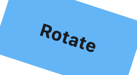
Rotate
from math import pi

import flet as ft


def main(page: ft.Page):
    page.horizontal_alignment = ft.CrossAxisAlignment.CENTER
    page.vertical_alignment = ft.MainAxisAlignment.CENTER
    page.add(
        ft.SafeArea(
            content=ft.Container(
                width=220,
                height=120,
                bgcolor=ft.Colors.BLUE_300,
                border_radius=16,
                alignment=ft.Alignment.CENTER,
                content=ft.Text("Rotate", size=28, weight=ft.FontWeight.BOLD),
                rotate=ft.Rotate(
                    angle=pi / 10,
                    alignment=ft.Alignment.CENTER,
                    filter_quality=ft.FilterQuality.MEDIUM,
                ),
            ),
        )
    )


if __name__ == "__main__":
    ft.run(main)
RotatedBox
import flet as ft


def _demo_control(content: ft.Control) -> ft.Container:
    return ft.Container(
        padding=10,
        border=ft.Border.all(1, ft.Colors.OUTLINE_VARIANT),
        border_radius=8,
        content=content,
    )


def _lane(title: str, controls: list[ft.Control]) -> ft.Container:
    return ft.Container(
        width=540,
        padding=12,
        border=ft.Border.all(1, ft.Colors.OUTLINE_VARIANT),
        border_radius=12,
        content=ft.Column(
            spacing=8,
            controls=[
                ft.Text(title, size=16, weight=ft.FontWeight.BOLD),
                ft.Divider(height=1),
                ft.Row(
                    spacing=14,
                    vertical_alignment=ft.CrossAxisAlignment.START,
                    controls=controls,
                ),
            ],
        ),
    )


def main(page: ft.Page):
    page.padding = 24
    page.scroll = ft.ScrollMode.AUTO
    page.add(
        ft.SafeArea(
            content=ft.Column(
                controls=[
                    ft.Text(
                        "RotatedBox rotates before layout. Compare occupied "
                        "space below:",
                        size=16,
                        weight=ft.FontWeight.W_500,
                    ),
                    ft.Column(
                        spacing=16,
                        controls=[
                            _lane(
                                "Normal controls",
                                [
                                    _demo_control(ft.Text("Text", size=26)),
                                    _demo_control(
                                        ft.ProgressBar(
                                            width=170, value=0.65, color=ft.Colors.GREEN
                                        )
                                    ),
                                    _demo_control(ft.Button("Button")),
                                ],
                            ),
                            _lane(
                                "RotatedBox quarter_turns=1",
                                [
                                    _demo_control(
                                        ft.RotatedBox(
                                            quarter_turns=1,
                                            content=ft.Text("Text", size=26),
                                        )
                                    ),
                                    _demo_control(
                                        ft.RotatedBox(
                                            quarter_turns=1,
                                            content=ft.ProgressBar(
                                                width=170,
                                                value=0.65,
                                                color=ft.Colors.GREEN,
                                            ),
                                        )
                                    ),
                                    _demo_control(
                                        ft.RotatedBox(
                                            quarter_turns=1,
                                            content=ft.Button("Button"),
                                        )
                                    ),
                                ],
                            ),
                        ],
                    ),
                ]
            )
        )
    )


if __name__ == "__main__":
    ft.run(main)

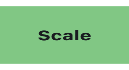
Scale
import flet as ft


def main(page: ft.Page):
    page.horizontal_alignment = ft.CrossAxisAlignment.CENTER
    page.vertical_alignment = ft.MainAxisAlignment.CENTER
    page.add(
        ft.SafeArea(
            content=ft.Container(
                width=220,
                height=120,
                bgcolor=ft.Colors.GREEN_300,
                border_radius=16,
                alignment=ft.Alignment.CENTER,
                content=ft.Text("Scale", size=28, weight=ft.FontWeight.BOLD),
                scale=ft.Scale(
                    scale_x=1.18,
                    scale_y=0.82,
                    alignment=ft.Alignment.CENTER,
                    filter_quality=ft.FilterQuality.MEDIUM,
                ),
            ),
        )
    )


if __name__ == "__main__":
    ft.run(main)
Offset
import flet as ft


def main(page: ft.Page):
    page.horizontal_alignment = ft.CrossAxisAlignment.CENTER
    page.vertical_alignment = ft.MainAxisAlignment.CENTER
    page.add(
        ft.SafeArea(
            content=ft.Stack(
                width=460,
                height=260,
                controls=[
                    ft.Text(
                        "Offset translates by control size.",
                        left=12,
                        top=8,
                        size=16,
                        color=ft.Colors.ON_SURFACE_VARIANT,
                    ),
                    ft.Container(
                        left=30,
                        top=70,
                        width=170,
                        height=90,
                        border_radius=16,
                        bgcolor=ft.Colors.BLUE_100,
                        border=ft.Border.all(2, ft.Colors.BLUE_GREY_400),
                        alignment=ft.Alignment.CENTER,
                        content=ft.Text(
                            "Original",
                            size=20,
                            color=ft.Colors.BLUE_GREY_700,
                        ),
                    ),
                    ft.Container(
                        left=30,
                        top=70,
                        width=170,
                        height=90,
                        border_radius=16,
                        bgcolor=ft.Colors.AMBER_300,
                        alignment=ft.Alignment.CENTER,
                        content=ft.Text("Offset", size=26, weight=ft.FontWeight.BOLD),
                        offset=ft.Offset(
                            x=1.05,
                            y=0.55,
                            filter_quality=ft.FilterQuality.MEDIUM,
                        ),
                    ),
                    ft.Icon(
                        ft.Icons.ARROW_RIGHT_ALT_ROUNDED,
                        left=212,
                        top=82,
                        size=44,
                        color=ft.Colors.BLUE_GREY_600,
                    ),
                    ft.Text(
                        "offset = Offset(1.05, 0.55)",
                        left=194,
                        top=222,
                        size=14,
                        color=ft.Colors.ON_SURFACE_VARIANT,
                    ),
                ],
            ),
        )
    )


if __name__ == "__main__":
    ft.run(main)
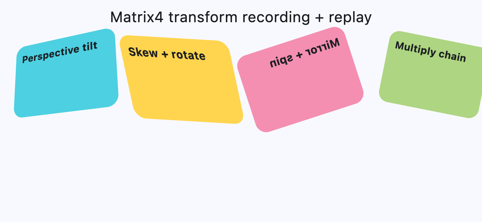
Matrix4 Transform
from math import pi

import flet as ft


def card(title: str, color: str, matrix: ft.Matrix4) -> ft.Container:
    return ft.Container(
        width=220,
        height=130,
        border_radius=18,
        bgcolor=color,
        padding=12,
        content=ft.Text(title, size=18, weight=ft.FontWeight.BOLD),
        transform=ft.Transform(
            matrix=matrix,
            alignment=ft.Alignment.CENTER,
            filter_quality=ft.FilterQuality.MEDIUM,
        ),
    )


def main(page: ft.Page):
    page.horizontal_alignment = ft.CrossAxisAlignment.CENTER
    page.scroll = ft.ScrollMode.AUTO
    page.spacing = 20

    perspective_tilt = (
        ft.Matrix4.identity()
        .set_entry(3, 2, 0.0018)
        .rotate_x(-0.35)
        .rotate_y(0.45)
        .translate(0, -10, 0)
    )

    skew_and_rotate = ft.Matrix4.skew_y(0.28).rotate_z(-pi / 14)

    mirrored_spin = ft.Matrix4.diagonal3_values(-1, 1, 1).rotate_z(pi / 10)

    mix = ft.Matrix4.translation_values(24, -8, 0).multiply(
        ft.Matrix4.rotation_z(pi / 16).scale(0.9, 0.9)
    )

    page.add(
        ft.SafeArea(
            content=ft.Column(
                spacing=20,
                horizontal_alignment=ft.CrossAxisAlignment.CENTER,
                controls=[
                    ft.Text("Matrix4 transform recording + replay", size=24),
                    ft.ResponsiveRow(
                        controls=[
                            ft.Container(
                                col={"sm": 6, "md": 3},
                                content=card(
                                    "Perspective tilt",
                                    ft.Colors.CYAN_300,
                                    perspective_tilt,
                                ),
                            ),
                            ft.Container(
                                col={"sm": 6, "md": 3},
                                content=card(
                                    "Skew + rotate",
                                    ft.Colors.AMBER_300,
                                    skew_and_rotate,
                                ),
                            ),
                            ft.Container(
                                col={"sm": 6, "md": 3},
                                content=card(
                                    "Mirror + spin",
                                    ft.Colors.PINK_200,
                                    mirrored_spin,
                                ),
                            ),
                            ft.Container(
                                col={"sm": 6, "md": 3},
                                content=card(
                                    "Multiply chain",
                                    ft.Colors.LIGHT_GREEN_300,
                                    mix,
                                ),
                            ),
                        ],
                    ),
                ],
            ),
        )
    )


if __name__ == "__main__":
    ft.run(main)
Properties��
alignclass-attributeinstance-attribute
align: Alignment | None = NoneAlignment of the control within its parent.
animate_alignclass-attributeinstance-attribute
animate_align: AnimationValue | None = NoneEnables implicit animation of the align property.
More information here.
animate_marginclass-attributeinstance-attribute
animate_margin: AnimationValue | None = NoneEnables implicit animation of the margin property.
More information here.
animate_offsetclass-attributeinstance-attribute
animate_offset: AnimationValue | None = NoneEnables implicit animation of the offset property.
More information here.
animate_opacityclass-attributeinstance-attribute
animate_opacity: AnimationValue | None = NoneEnables implicit animation of the opacity property.
More information here.
animate_positionclass-attributeinstance-attribute
animate_position: AnimationValue | None = NoneEnables implicit animation of the positioning properties (left, right, top and bottom).
More information here.
animate_rotationclass-attributeinstance-attribute
animate_rotation: AnimationValue | None = NoneEnables implicit animation of the rotate property.
More information here.
animate_scaleclass-attributeinstance-attribute
animate_scale: AnimationValue | None = NoneEnables implicit animation of the scale property.
More information here.
aspect_ratioclass-attributeinstance-attribute
aspect_ratio: Number | None = NoneThe aspect ratio of the control.
It is defined as the ratio of width to height.
In current implementation, if aspect_ratio is set, width
and height on the same control are ignored for final rendered size.
bottomclass-attributeinstance-attribute
bottom: Number | None = NoneThe distance that the child's bottom edge is inset from the bottom of the stack.
Effective only if this control is a descendant of one of the following:
Stack control, Page.overlay list.
flipclass-attributeinstance-attribute
flip: Flip | None = NoneFlips this control horizontally and/or vertically.
Set to an instance of Flip to mirror across x-axis, y-axis, or both.
heightclass-attributeinstance-attribute
height: Number | None = NoneImposed Control height in virtual pixels.
leftclass-attributeinstance-attribute
left: Number | None = NoneThe distance that the child's left edge is inset from the left of the stack.
Effective only if this control is a descendant of one of the following:
Stack control, Page.overlay list.
marginclass-attributeinstance-attribute
margin: MarginValue | None = NoneSets the margin of the control.
offsetclass-attributeinstance-attribute
offset: OffsetValue | None = NoneApplies a translation transformation before painting the control.
The translation is expressed as an Offset scaled to the control's size.
So, Offset(x=0.25, y=0), for example, will result in a horizontal translation
of one quarter the width of this control.
Example
The following example displays container at 0, 0 top left corner of a stack
as transform applies -1 * 100, -1 * 100 (offset * control's size)
horizontal and vertical translations to the control:
import flet as ft

def main(page: ft.Page):
    page.add(
        ft.Stack(
            width=1000,
            height=1000,
            controls=[
                ft.Container(
                    bgcolor=ft.Colors.RED,
                    width=100,
                    height=100,
                    left=100,
                    top=100,
                    offset=ft.Offset(-1, -1),
                )
            ],
        )
    )

ft.run(main)
rightclass-attributeinstance-attribute
right: Number | None = NoneThe distance that the child's right edge is inset from the right of the stack.
Effective only if this control is a descendant of one of the following:
Stack control, Page.overlay list.
rotateclass-attributeinstance-attribute
rotate: RotateValue | None = NoneTransforms this control using a rotation around its center.
The value of rotate property could be one of the following types:
number- a rotation in clockwise radians. Full circle360°ismath.pi * 2radians,90°ispi / 2,45°ispi / 4, etc.Rotate- allows to specify rotationangleas well asalignment- the location of rotation center.
ft.Image(
    src="https://picsum.photos/100/100",
    width=100,
    height=100,
    border_radius=5,
    rotate=Rotate(angle=0.25 * pi, alignment=ft.Alignment.CENTER_LEFT)
)
scaleclass-attributeinstance-attribute
scale: ScaleValue | None = NoneScales this control along the 2D plane. Default scale factor is 1.0, meaning no-scale.
Setting this property to 0.5, for example, makes this control twice smaller,
while 2.0 makes it twice larger.
Different scale multipliers can be specified for x and y axis, by setting
Control.scale property to an instance of Scale class.
Either scale or scale_x and scale_y could be specified, but not all of them.
ft.Image(
    src="https://picsum.photos/100/100",
    width=100,
    height=100,
    border_radius=5,
    scale=ft.Scale(scale_x=2, scale_y=0.5)
)
size_change_intervalclass-attributeinstance-attribute
size_change_interval: int = 10Sampling interval in milliseconds for on_size_change event.
Setting to 0 calls on_size_change immediately
on every change.
topclass-attributeinstance-attribute
top: Number | None = NoneThe distance that the child's top edge is inset from the top of the stack.
Effective only if this control is a descendant of one of the following:
Stack control, Page.overlay list.
Events
on_animation_endclass-attributeinstance-attribute
on_animation_end: (
    ControlEventHandler[LayoutControl] | None
) = None
Called when animation completes.
Can be used to chain multiple animations.
The data property of the event handler argument contains the name
of the animation.
More information here.
on_size_changeclass-attributeinstance-attribute
on_size_change: (
    EventHandler[LayoutSizeChangeEvent[LayoutControl]]
    | None
) = None
Called when the size of this control changes.
size_change_interval defines how often this event is called.