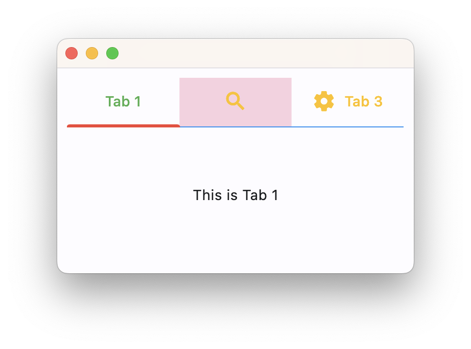
TabsTheme
Customizes the appearance of Tabs control across the app.
TabsTheme class has the following properties:
divider_color
The color of the divider.
indicator_border_radius
The radius of the indicator's corners.
indicator_border_side
The color and weight of the horizontal line drawn below the selected tab.
indicator_padding
Locates the selected tab's underline relative to the tab's boundary. The indicator_tab_size property can be used to define the tab indicator's bounds in terms of its (centered) tab widget with False, or the entire tab with True.
indicator_color
The color of the line that appears below the selected tab.
indicator_tab_size
True` for indicator to take entire tab.
label_color
The color of selected tab labels.
unselected_label_color
The color of unselected tab labels.
overlay_color
Defines the ink response focus, hover, and splash colors. If specified, it is resolved against one
of ControlState.FOCUSED, ControlState.HOVERED, and ControlState.PRESSED.
Example
page.theme = ft.Theme(
    tabs_theme=ft.TabsTheme(
        divider_color=ft.Colors.BLUE,
        indicator_color=ft.Colors.RED,
        indicator_tab_size=True,
        label_color=ft.Colors.GREEN,
        unselected_label_color=ft.Colors.AMBER,
        overlay_color={
            ft.MaterialState.FOCUSED: ft.Colors.with_opacity(0.2, ft.Colors.GREEN),
            ft.MaterialState.DEFAULT: ft.Colors.with_opacity(0.2, ft.Colors.PINK),
        },
    )
)
