ScrollbarTheme
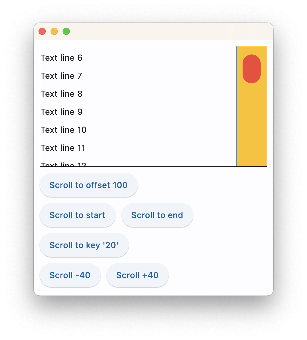
Customizes the colors, thickness, and shape of scrollbars across the app.
ScrollbarTheme class has the following properties:
thumb_visibility
Indicates that the scrollbar thumb should be visible, even when a scroll is not underway. When False, the scrollbar
will be shown during scrolling and will fade out otherwise. When True, the scrollbar will always be visible and never
fade out. Property value could be either a single boolean value or a dictionary with ft.ControlState as keys and
boolean as values.
thickness
The thickness of the scrollbar in the cross axis of the scrollable. Property value could be either a single float value
or a dictionary with ft.ControlState as keys and float as values.
track_visibility
Indicates that the scrollbar track should be visible. When True, the scrollbar track will always be visible so long as
the thumb is visible. If the scrollbar thumb is not visible, the track will not be visible either. Defaults to False
when None. If this property is None, then ScrollbarTheme.track_visibility of Theme.scrollbar_theme is used. If
that is also None, the default value is False. Property value could be either a single boolean value or a dictionary
with ft.ControlState as keys and boolean as values.
radius
The Radius of the scrollbar thumb's rounded rectangle corners.
thumb_color
Overrides the default Color of the Scrollbar thumb. The value is either a single color string or ft.ControlState
dictionary.
track_color
Overrides the default Color of the Scrollbar track. The value is either a single color string or ft.ControlState
dictionary.
track_border_color
Overrides the default Color of the Scrollbar track border. The value is either a single color string
or ft.ControlState dictionary.
cross_axis_margin
Distance from the scrollbar thumb to the nearest cross axis edge in logical pixels. The scrollbar track consumes this space. Must not be null and defaults to 0.
main_axis_margin
Distance from the scrollbar thumb's start and end to the edge of the viewport in logical pixels. It affects the amount of available paint area. The scrollbar track consumes this space. Mustn't be null and defaults to 0.
min_thumb_length
The preferred smallest size the scrollbar thumb can shrink to when the total scrollable extent is large, the current visible viewport is small, and the viewport is not overscrolled.
interactive
Whether the Scrollbar should be interactive and respond to dragging on the thumb, or tapping in the track area. When False, the scrollbar will not respond to gesture or hover events, and will allow to click through it. Defaults to True when None, unless on Android, which will default to False when None.
Example
page.theme = ft.Theme(
    scrollbar_theme=ft.ScrollbarTheme(
        track_color={
            ft.MaterialState.HOVERED: ft.Colors.AMBER,
            ft.MaterialState.DEFAULT: ft.Colors.TRANSPARENT,
        },
        track_visibility=True,
        track_border_color=ft.Colors.BLUE,
        thumb_visibility=True,
        thumb_color={
            ft.MaterialState.HOVERED: ft.Colors.RED,
            ft.MaterialState.DEFAULT: ft.Colors.GREY_300,
        },
        thickness=30,
        radius=15,
        main_axis_margin=5,
        cross_axis_margin=10,
    )
)
