PlotlyChart
Displays Plotly chart.
Examples
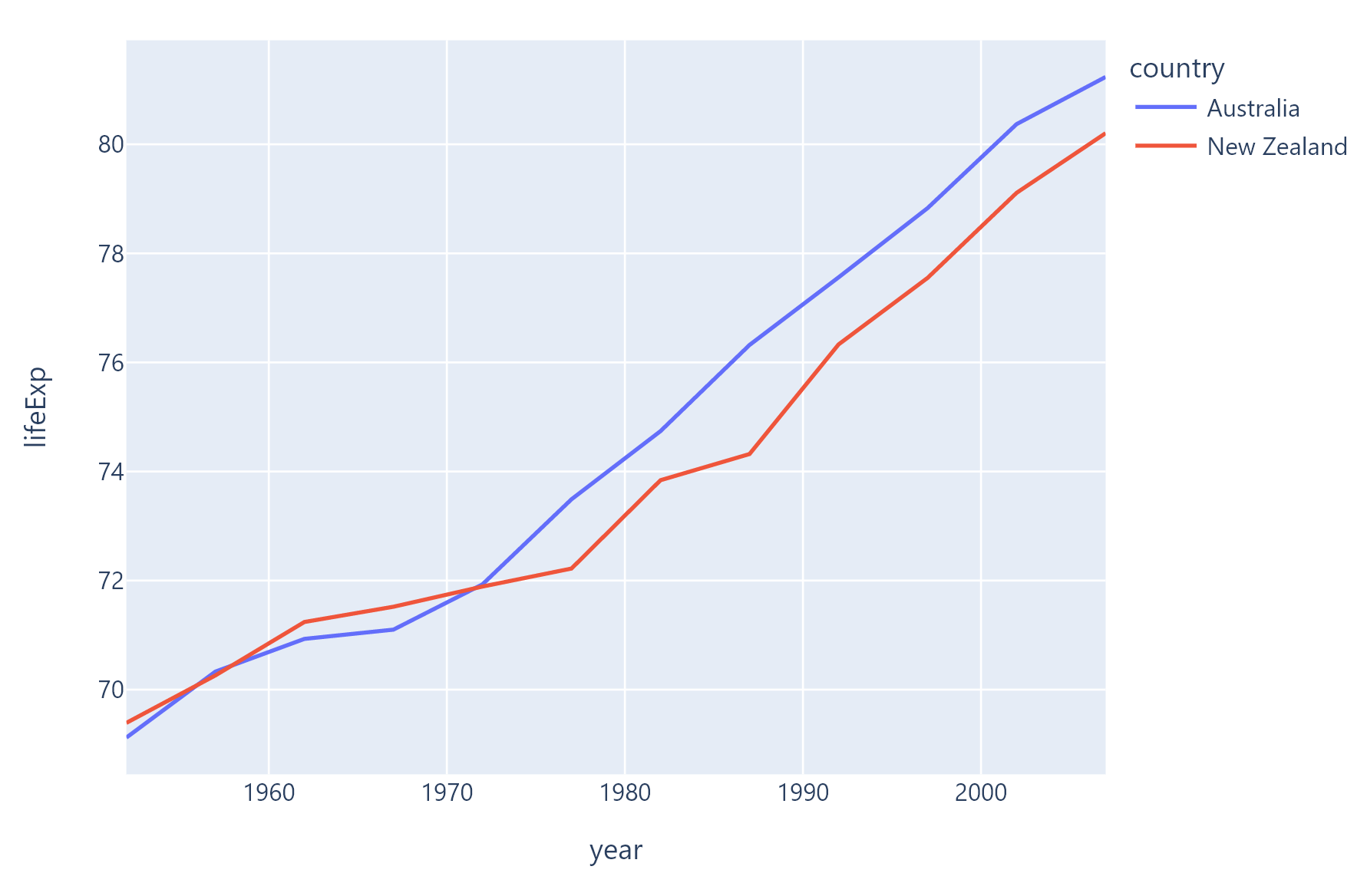
Line chart
The following example is based on original example from Plotly docs.
loading...
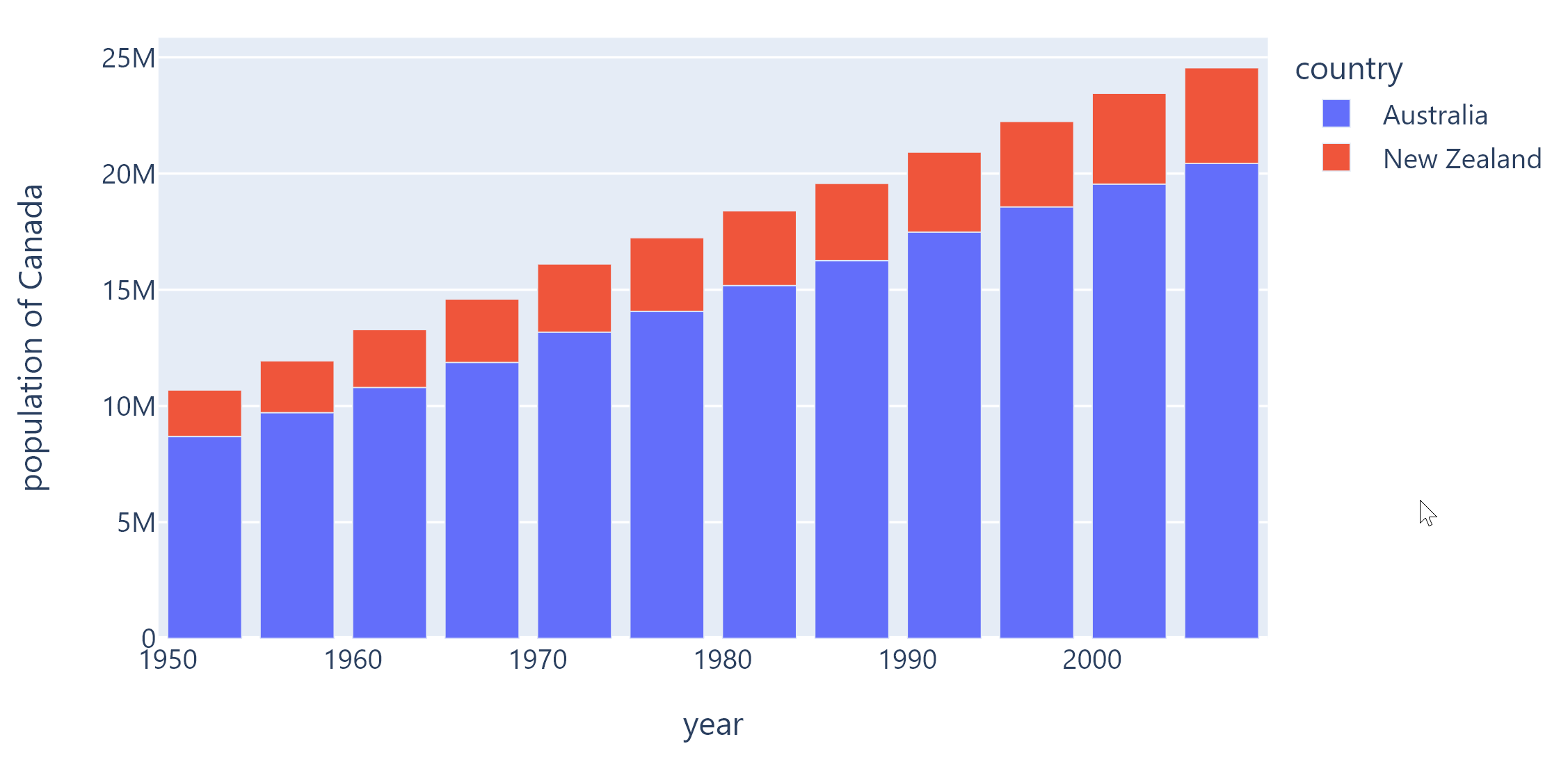
Bar chart
The following example is based on original example from Plotly docs.
loading...
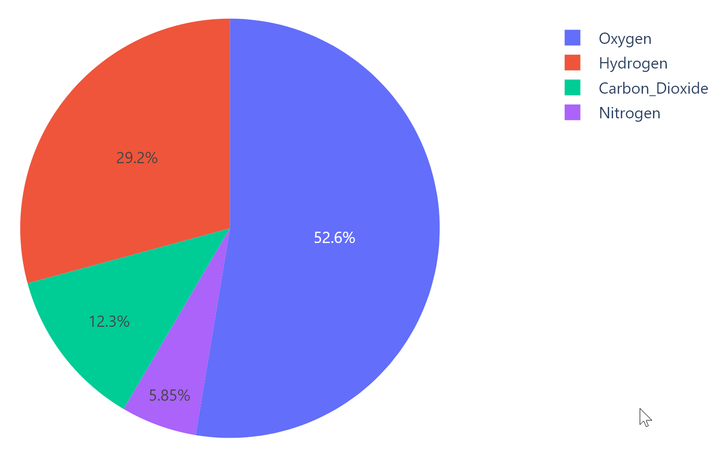
Pie chart
The following example is based on original example from Plotly docs.
loading...
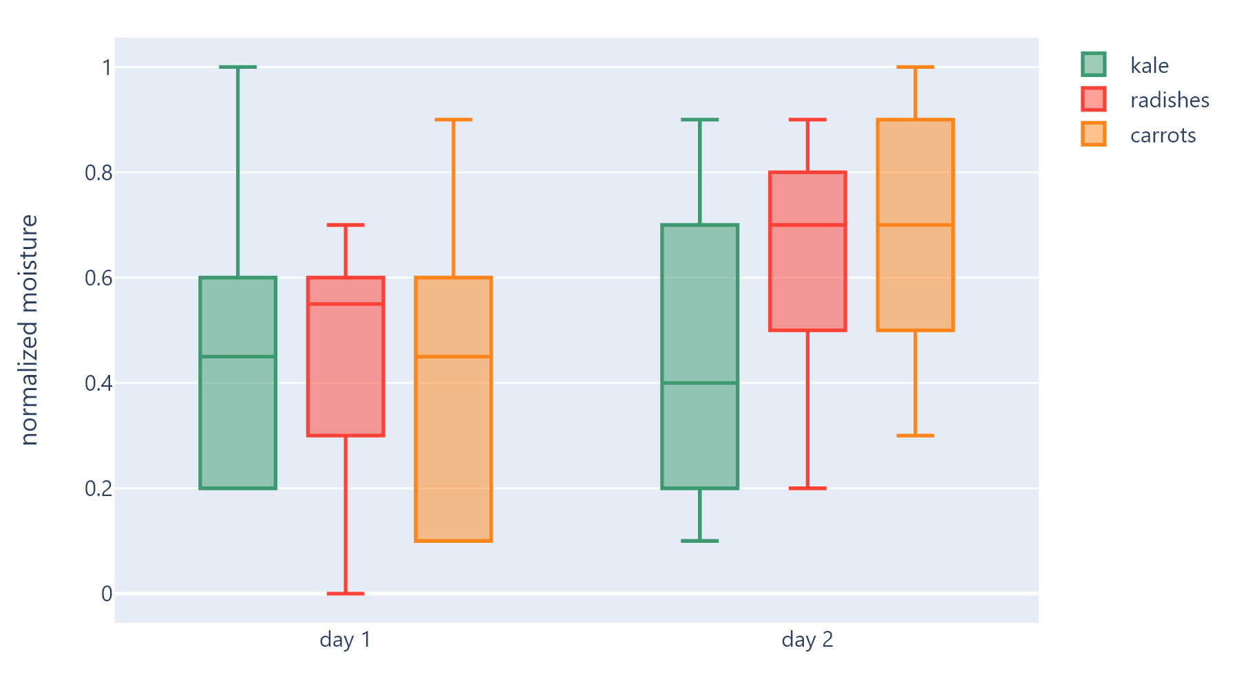
Box chart
The following example is based on original example from Plotly docs.
loading...
Properties
figure
Plotly figure to draw - an instance of plotly.graph_objects.Figure class.
original_size
True to display chart in original size. False (default) to display a chart that fits configured bounds.
isolated
Every time when a page or parent chart control are updated with page.update() or Control.update() methods respectively the chart is re-drawn by calling Plotly API. Frequent re-drawings of large charts could affect the performance of the entire Flet app.
Set isolated to True to enable explicit chart updates. To re-draw the chart call its update() method.