9 posts tagged with "release"

View All Tags

Fun with animations

ยท 2 min read
Feodor Fitsner
Flet founder and developer

Despite Flet release debuting animations support was released some time ago, we've just finished documenting its new features! We all know if the feature is not documented it just doesn't exist! ๐Ÿ˜‰

Flutter offers multiple approaches for creating animations such "implicit", "explicit", "tween", "stagered", "pre-canned" animations as well as displaying animation scenes prepared in Rive and Lottie editors.

We are starting with "implicit" animations which allows you to animate a control property by setting a target value; whenever that target value changes, the control animates the property from the old value to the new one.
Demo timeโ€‹

Explore demo sources. The demo is hosted on Heroku, by the way, so you can use it as a starting point for your own deployments.

Implicit animationsโ€‹

Implicit animations can be enabled for the following control properties:

Additionally, all Container control properties can be now animated and there is a new AnimatedSwitcher control for animated transition between old a new content.

Other new featuresโ€‹

Markdown controlโ€‹

Allows to render text in Markdown format. Supports various extensions: CommonMark, GitHub Web and GitHub Flavored.

See Markdown control docs for more information and examples.

URL launcherโ€‹

page.launch_url(url) method allows programmatically opening a URL in a new browser window, for example:

page.launch_url("https://google.com")

It also works nice with Markdown control for opening links within markdown document.

Keyboard shortcutsโ€‹

Page now contains on_keyboard_event event handlet to globally intercept all keystrokes.

Check this simple usage example.

Accessibility improvementsโ€‹

We added Accessibility section to the docs covering semantics support for screen readers.

ShaderMark controlโ€‹

A control that applies a mask generated by a shader to its content. Allows making nice effects like gradually fading out images.

That's it!

Give Flet a try and let us know what you think!

Beautiful gradients, button styles and TextField rounded corners in a new Flet release

ยท 4 min read
Feodor Fitsner
Flet founder and developer

We've just released Flet 0.1.46 adding new exciting features:

  • Gradient backgrounds in Container
  • Extensive styling for buttons, TextField and Dropdown controls
  • ...and more

Gradient backgroundsโ€‹

Linear gradientโ€‹

import math
import flet as ft

def main(page: ft.Page):

page.add(
ft.Container(
alignment=ft.alignment.center,
gradient=ft.LinearGradient(
begin=ft.alignment.top_left,
end=Alignment(0.8, 1),
colors=[
"0xff1f005c",
"0xff5b0060",
"0xff870160",
"0xffac255e",
"0xffca485c",
"0xffe16b5c",
"0xfff39060",
"0xffffb56b",
],
tile_mode=ft.GradientTileMode.MIRROR,
rotation=math.pi / 3,
),
width=150,
height=150,
border_radius=5,
)
)

ft.app(target=main)

Check LinearGradient docs for more information about LinearGradient properties.

Radial gradientโ€‹

import flet as ft

def main(page: ft.Page):

page.add(
ft.Container(
alignment=ft.alignment.center,
gradient=ft.RadialGradient(
center=Alignment(0.7, -0.6),
radius=0.2,
colors=[
"0xFFFFFF00", # yellow sun
"0xFF0099FF", # blue sky
],
stops=[0.4, 1.0],
),
width=150,
height=150,
border_radius=5,
)
)

ft.app(target=main)

Check RadialGradient docs for more information about RadialGradient properties.

Sweep gradientโ€‹

import math
import flet as ft

def main(page: ft.Page):

page.add(
ft.Container(
alignment=ft.alignment.center,
gradient=SweepGradient(
center=ft.alignment.center,
start_angle=0.0,
end_angle=math.pi * 2,
colors=[
"0xFF4285F4",
"0xFF34A853",
"0xFFFBBC05",
"0xFFEA4335",
"0xFF4285F4",
],
stops=[0.0, 0.25, 0.5, 0.75, 1.0],
),
width=150,
height=150,
border_radius=5,
)
)

ft.app(target=main)

Check SweepGradient docs for more information about SweepGradient properties.

Buttons stylingโ€‹

This Flet release introduces style property to all button controls which is an instance of ButtonStyle class. ButtonStyle allows controlling all visual aspects of a button, such as shape, foreground, background and shadow colors, content padding, border width and radius!

Moreover, each individual style attribute could be configured for a different "Material states" of a button, such as "hovered", "focused", "disabled" and others. For example, you can configure a different shape, background color for a hovered state and configure fallback values for all other states.

Check this "extreme" styling example:

import flet as ft
from flet.border import BorderSide
from flet.buttons import RoundedRectangleBorder

def main(page: ft.Page):

page.add(
ft.ElevatedButton(
"Styled button 1",
style=ft.ButtonStyle(
color={
ft.MaterialState.HOVERED: ft.Colors.WHITE,
ft.MaterialState.FOCUSED: ft.Colors.BLUE,
ft.MaterialState.DEFAULT: ft.Colors.BLACK,
},
bgcolor={ft.MaterialState.FOCUSED: ft.Colors.PINK_200, "": ft.Colors.YELLOW},
padding={ft.MaterialState.HOVERED: 20},
overlay_color=ft.Colors.TRANSPARENT,
elevation={"pressed": 0, "": 1},
animation_duration=500,
side={
ft.MaterialState.DEFAULT: BorderSide(1, ft.Colors.BLUE),
ft.MaterialState.HOVERED: BorderSide(2, ft.Colors.BLUE),
},
shape={
ft.MaterialState.HOVERED: RoundedRectangleBorder(radius=20),
ft.MaterialState.DEFAULT: RoundedRectangleBorder(radius=2),
},
),
)
)

ft.app(target=main)

ft.MaterialState.DEFAULT state is a fallback style.

Button shape could also be changed with ButtonStyle.shape property:

import flet as ft
from flet.buttons import (
BeveledRectangleBorder,
CircleBorder,
ContinuousRectangleBorder,
RoundedRectangleBorder,
StadiumBorder,
)

def main(page: ft.Page):
page.padding = 30
page.spacing = 30
page.add(
ft.FilledButton(
"Stadium",
style=ft.ButtonStyle(
shape=ft.StadiumBorder(),
),
),
ft.FilledButton(
"Rounded rectangle",
style=ft.ButtonStyle(
shape=ft.RoundedRectangleBorder(radius=10),
),
),
ft.FilledButton(
"Continuous rectangle",
style=ft.ButtonStyle(
shape=ft.ContinuousRectangleBorder(radius=30),
),
),
ft.FilledButton(
"Beveled rectangle",
style=ft.ButtonStyle(
shape=ft.BeveledRectangleBorder(radius=10),
),
),
ft.FilledButton(
"Circle",
style=ft.ButtonStyle(shape=ft.CircleBorder(), padding=30),
),
)

ft.app(target=main)

Check ElevatedButton.style property docs for a complete description of ButtonStyle class and its properties.

TextField and Dropdown stylingโ€‹

It is now possible to configure text size, border style and corners radius for normal and focused states of TextField and Dropdown controls. TextField also allows configuring colors for a cursor and selection.

Additionally, the maximum length of entered into TextField can now be limited with max_length property.

We also introduced capitalization property for automatic capitalization of characters as you type them into TextField. You can choose from 4 capitalization strategies: none (default), characters, words and sentences.

An example of styled TextField with max_length and capitalization:

import flet as ft

def main(page: ft.Page):
page.padding = 50
page.add(
ft.TextField(
text_size=30,
cursor_color=ft.Colors.RED,
selection_color=ft.Colors.YELLOW,
color=ft.Colors.PINK,
bgcolor=ft.Colors.BLACK26,
filled=True,
focused_color=ft.Colors.GREEN,
focused_bgcolor=ft.Colors.CYAN_200,
border_radius=30,
border_color=ft.Colors.GREEN_800,
focused_border_color=ft.Colors.GREEN_ACCENT_400,
max_length=20,
capitalization="characters",
)
)

ft.app(target=main)

An example of styled Dropdown control:

import flet as ft

def main(page: ft.Page):
page.padding = 50
page.add(
ft.Dropdown(
options=[
ft.dropdown.Option("a", "Item A"),
ft.dropdown.Option("b", "Item B"),
ft.dropdown.Option("c", "Item C"),
],
border_radius=30,
filled=True,
border_color=ft.Colors.TRANSPARENT,
bgcolor=ft.Colors.BLACK12,
focused_bgcolor=ft.Colors.BLUE_100,
)
)

ft.app(target=main)

Other changesโ€‹

IconButton got selected state which plays nice with a new style.

This is an example of a toggle icon button:

import flet as ft

def main(page: ft.Page):

def toggle_icon_button(e):
e.control.selected = not e.control.selected
e.control.update()

page.add(
ft.IconButton(
icon=ft.Icons.BATTERY_1_BAR,
selected_icon=ft.Icons.BATTERY_FULL,
on_click=toggle_icon_button,
selected=False,
style=ft.ButtonStyle(color={"selected": ft.Colors.GREEN, "": ft.Colors.RED}),
)
)

ft.app(target=main)

Give Flet a try and let us know what you think!

Navigation and Routing

ยท 5 min read
Feodor Fitsner
Flet founder and developer

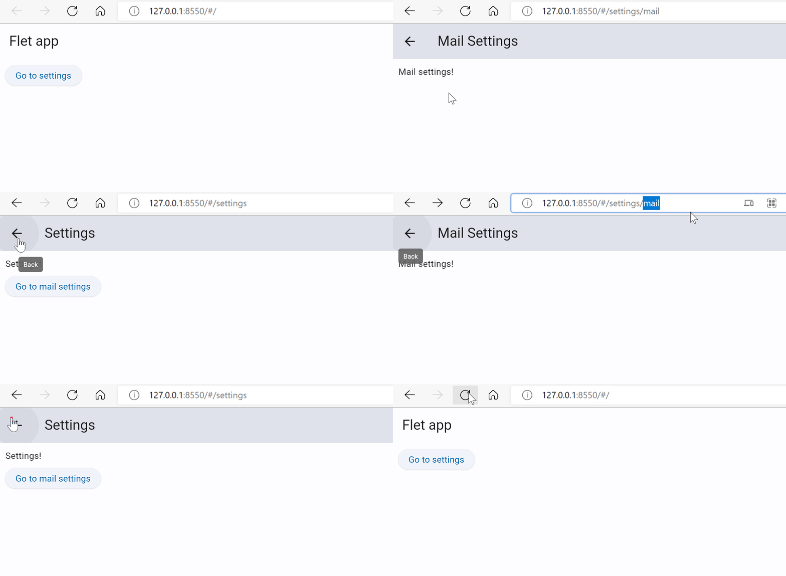
Flet 0.1.42 has been released with navigation and routing!

Navigation and routing is an essential feature of Single Page Applications (SPA) which allows organizing application user interface into virtual pages (views) and "navigate" between them while application URL reflects the current state of the app.

For mobile apps navigation and routing serves as a deep linking to specific application parts.

Well, it took more efforts than expected to add navigation and routing into Flet as the implementation is based on Navigator 2.0 Flutter API and required to replace Flet's "Page" abstraction with "Page and Views". Flutter's newer navigation and routing API has substantial improvements such as:

  1. Programmatic control over history stack.
  2. An easy way to intercept a call to "Back" button in AppBar.
  3. Robust synchronization with browser history.

Explore source code of the example above.

Page routeโ€‹

Page route is a portion of application URL after # symbol:

Default application route, if not set in application URL by the user, is /. All routes start with /, for example /store, /authors/1/books/2.

Application route can be obtained by reading page.route property, for example:

import flet as ft

def main(page: ft.Page):
page.add(ft.Text(f"Initial route: {page.route}"))

ft.app(target=main, view=ft.AppView.WEB_BROWSER)

Grab application URL, open a new browser tab, paste the URL, modify its part after # to /test and hit enter. You should see "Initial route: /test".

Every time the route in the URL is changed (by editing the URL or navigating browser history with Back/Forward buttons) Flet calls page.on_route_change event handler:

import flet as ft

def main(page: ft.Page):
page.add(ft.Text(f"Initial route: {page.route}"))

def route_change(route):
page.add(ft.Text(f"New route: {route}"))

page.on_route_change = route_change
page.update()

ft.app(target=main, view=ft.AppView.WEB_BROWSER)

Now try updating URL hash a few times and then use Back/Forward buttons! You should see a new message added to a page each time the route changes:

Route can be changed programmatically, by updating page.route property:

import flet as ft

def main(page: ft.Page):
page.add(ft.Text(f"Initial route: {page.route}"))

def route_change(route):
page.add(ft.Text(f"New route: {route}"))

def go_store(e):
page.route = "/store"
page.update()

page.on_route_change = route_change
page.add(ft.ElevatedButton("Go to Store", on_click=go_store))

ft.app(target=main, view=ft.AppView.WEB_BROWSER)

Click "Go to Store" button and you'll see application URL is changed and a new item is pushed in a browser history. You can use browser "Back" button to navigate to a previous route.

Page viewsโ€‹

Flet's Page now is not just a single page, but a container for View layered on top of each other like a sandwich:

A collection of views represents navigator history. Page has page.views property to access views collection.

The last view in the list is the one currently displayed on a page. Views list must have at least one element (root view).

To simulate a transition between pages change page.route and add a new View in the end of page.view list.

Pop the last view from the collection and change route to a "previous" one in page.on_view_pop event handler to go back.

Building views on route changeโ€‹

To build a reliable navigation there must be a single place in the program which builds a list of views depending on the current route. Other words, navigation history stack (represented by the list of views) must be a function of a route.

This place is page.on_route_change event handler.

Let's put everything together into a complete example which allows navigating between two pages:

import flet as ft

def main(page: ft.Page):
page.title = "Routes Example"

def route_change(route):
page.views.clear()
page.views.append(
ft.View(
"/",
[
ft.AppBar(title=ft.Text("Flet app"), bgcolor=ft.Colors.SURFACE_VARIANT),
ft.ElevatedButton("Visit Store", on_click=lambda _: page.go("/store")),
],
)
)
if page.route == "/store":
page.views.append(
ft.View(
"/store",
[
ft.AppBar(title=ft.Text("Store"), bgcolor=ft.Colors.SURFACE_VARIANT),
ft.ElevatedButton("Go Home", on_click=lambda _: page.go("/")),
],
)
)
page.update()

def view_pop(view):
page.views.pop()
top_view = page.views[-1]
page.go(top_view.route)

page.on_route_change = route_change
page.on_view_pop = view_pop
page.go(page.route)


ft.app(target=main, view=ft.AppView.WEB_BROWSER)

Try navigating between pages using "Visit Store" and "Go Home" buttons, Back/Forward browser buttons, manually changing route in the URL - it works no matter what! :)

note

To "navigate" between pages we used page.go(route) - a helper method that updates page.route, calls page.on_route_change event handler to update views and finally calls page.update().

Notice the usage of page.on_view_pop event handler. It fires when the user clicks automatic "Back" button in AppBar control. In the handler we remove the last element from views collection and navigate to view's root "under" it.

Route templatesโ€‹

Flet offers TemplateRoute - an utility class based on repath library which allows matching ExpressJS-like routes and parsing their parameters, for example /account/:account_id/orders/:order_id.

TemplateRoute plays great with route change event:

troute = TemplateRoute(page.route)

if troute.match("/books/:id"):
print("Book view ID:", troute.id)
elif troute.match("/account/:account_id/orders/:order_id"):
print("Account:", troute.account_id, "Order:", troute.order_id)
else:
print("Unknown route")

You can read more about template syntax supported by repath library here.

That's all for today!

Give Flet a try and let us know what you think!

New release: Drag and Drop, absolute positioning and clickable container

ยท 2 min read
Feodor Fitsner
Flet founder and developer

We have just released Flet 0.1.41 with drag-and-drop support and other neat features such as absolute positioning of controls inside stack and clickable container!

Drag and Dropโ€‹

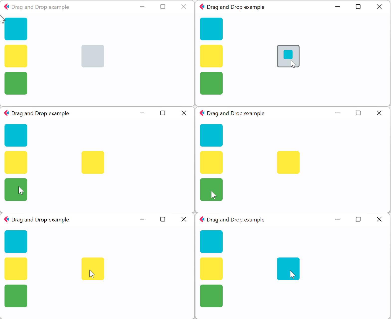
Making drag-and-drop in Flet is a real joy - thanks to a smart drag-and-drop implementation in Flutter! You just have "draggable" control which could be dragged to a "drag target" which calls on_accept event handler when draggable is dropped.

Take a look at Drag-and-Drop example.

Explore Draggable and DragTarget controls, their properties and events.

Absolute positioning inside Stackโ€‹

All visible controls now have left top, right and bottom properties to let them be absolutely positioned inside Stack, for example:

import flet as ft

def main(page: ft.Page):

page.horizontal_alignment = ft.CrossAxisAlignment.CENTER
page.vertical_alignment = ft.MainAxisAlignment.CENTER

page.add(
ft.Container(
ft.Stack(
[
ft.Text("1", color=ft.Colors.WHITE),
ft.Text("2", color=ft.Colors.WHITE, right=0),
ft.Text("3", color=ft.Colors.WHITE, right=0, bottom=0),
ft.Text("4", color=ft.Colors.WHITE, left=0, bottom=0),
ft.Text("5", color=ft.Colors.WHITE, left=40, top=35),
]
),
border_radius=8,
padding=5,
width=100,
height=100,
bgcolor=ft.Colors.BROWN_700,
)
)

ft.app(target=main)

Clickable containerโ€‹

Container control has got on_click event which allows you to make a button from any control and with a beautiful material ripple effect when ink is set to True!

See source code for the example above.

Give Flet a try and let us know what you think!